A year-plus engagement reshaping every touchpoint a developer hits with PubNub's realtime communication APIs — from marketing site through onboarding, signup, dashboards, and docs.
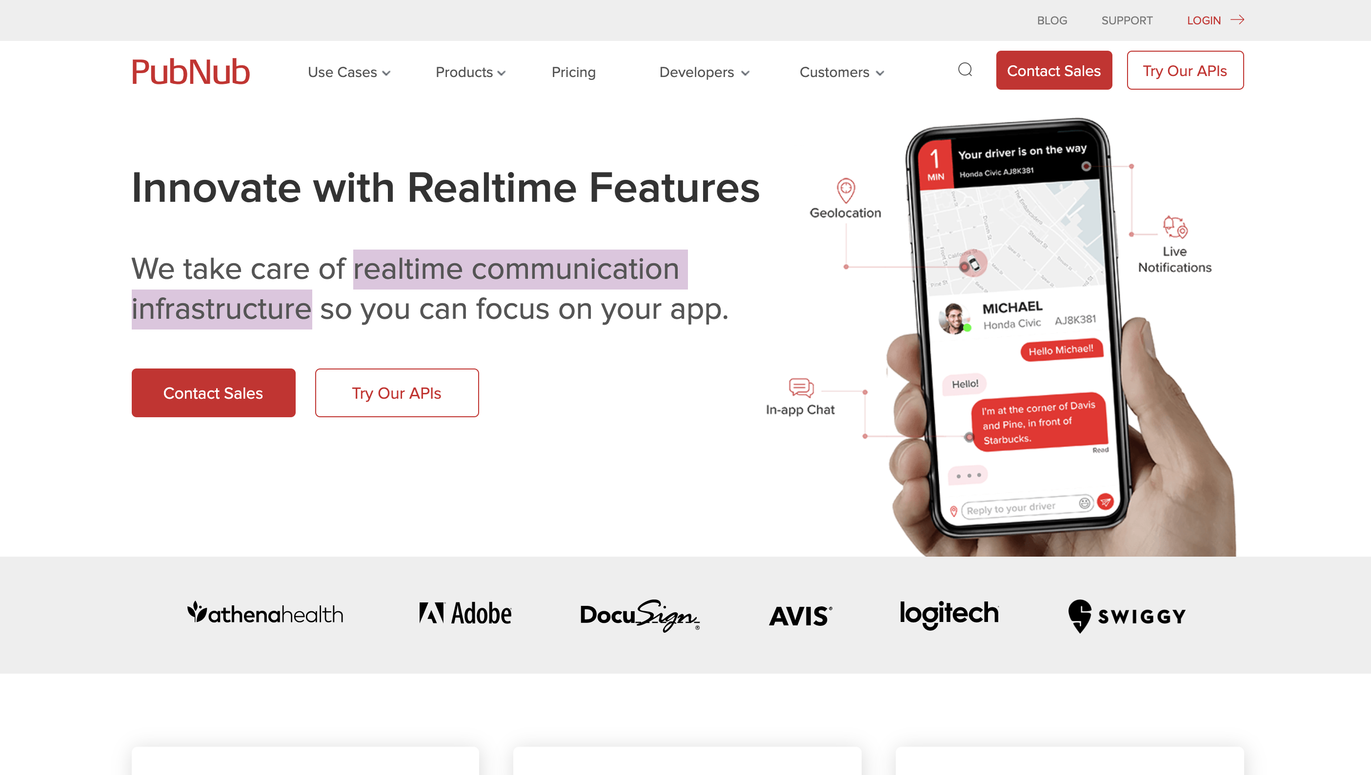
PubNub is realtime communication infrastructure — APIs that let other companies build chat, presence, and live data into their products without building the plumbing themselves.
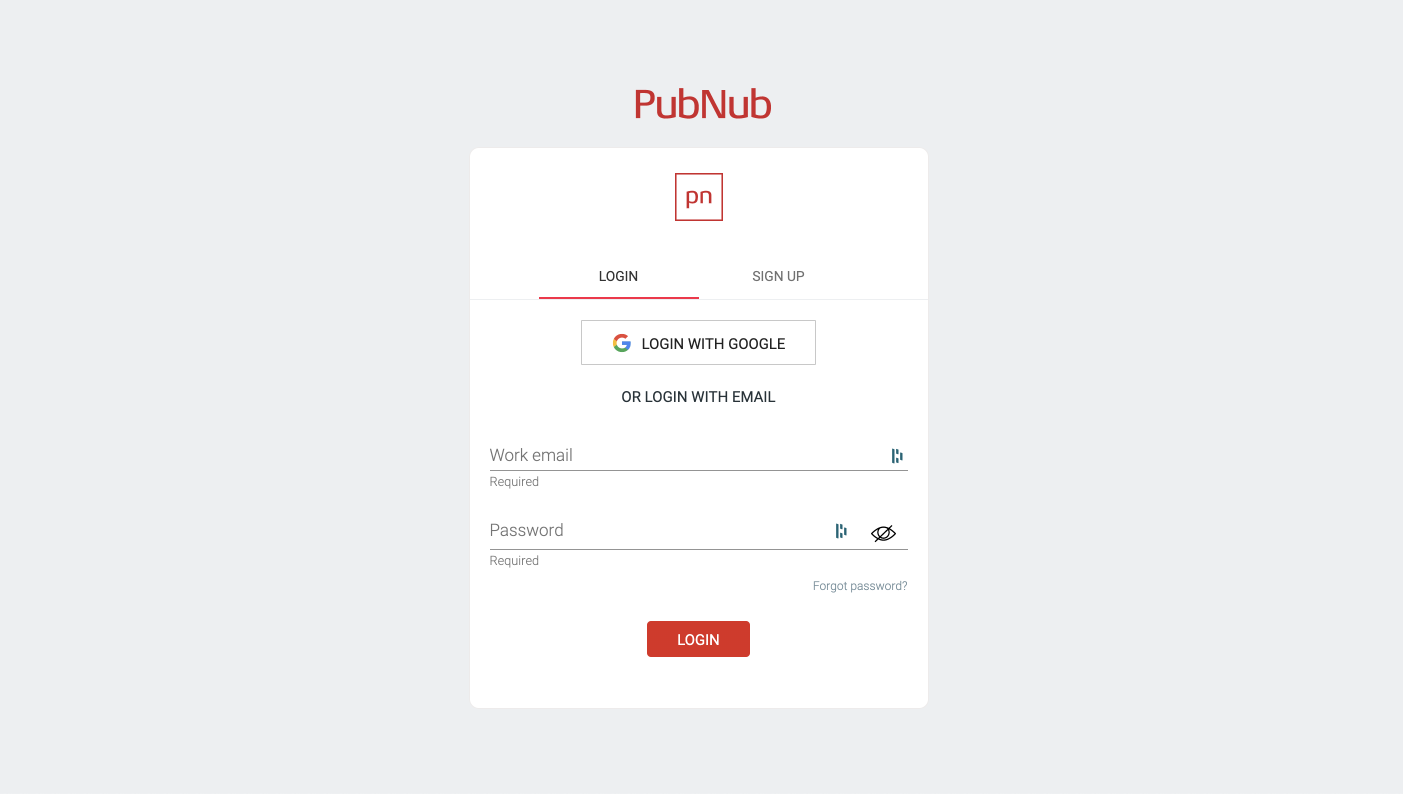
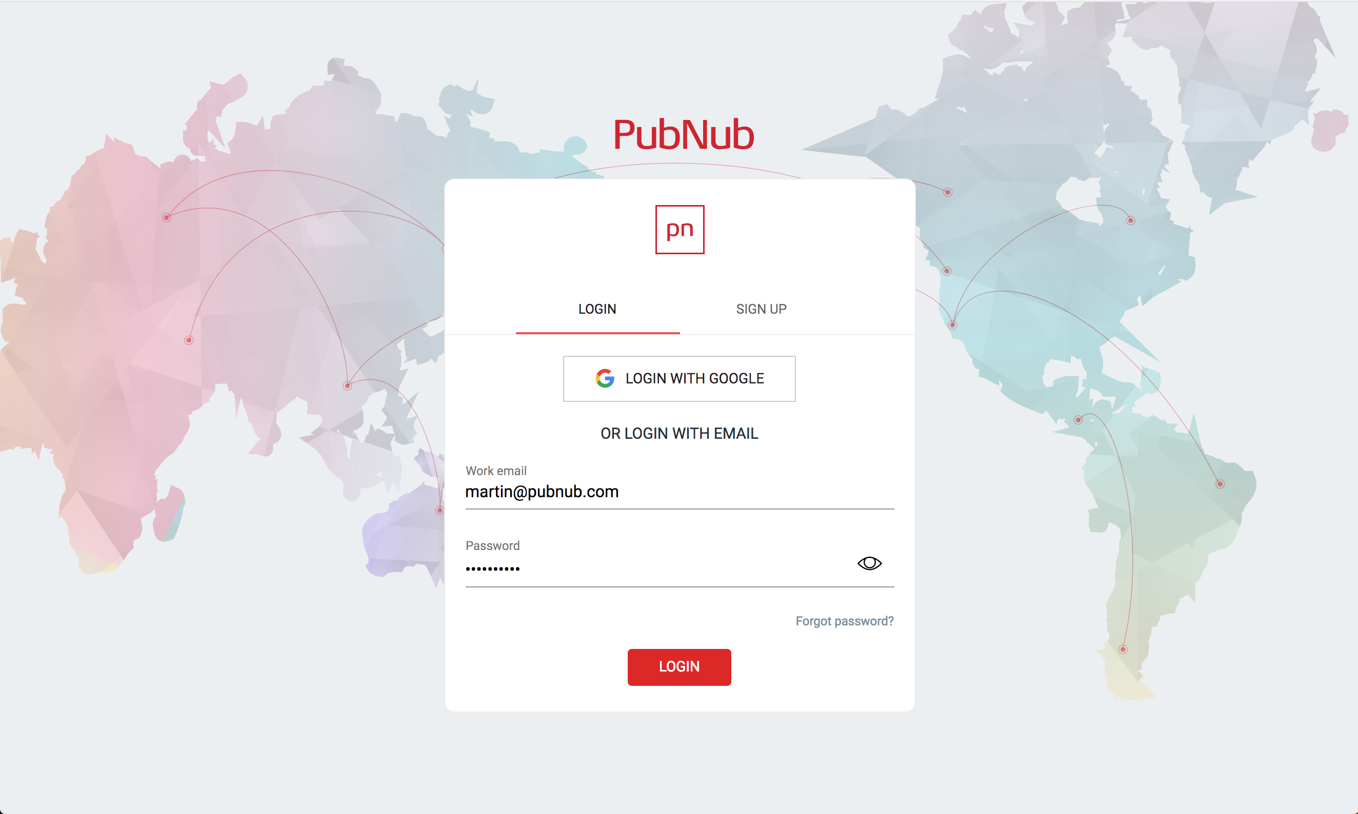
The APIs were strong. The path to using them — marketing site, signup, portal, docs, first SDK integration — was where developers were dropping off. Free-to-paid conversion was suffering, and the team wanted to find out why.
Walk the developer journey end-to-end, marketing through paid tier — using UX, visual, and copy to find where friction lived.
Move developers from 'signed up' to 'actually using' — through clearer first-time flows and better help in context.
Make it dramatically easier for a developer to integrate their first PubNub API — the leading indicator for everything that follows.
Once developers were using the product, give them the clearest possible path — and reason — to upgrade.
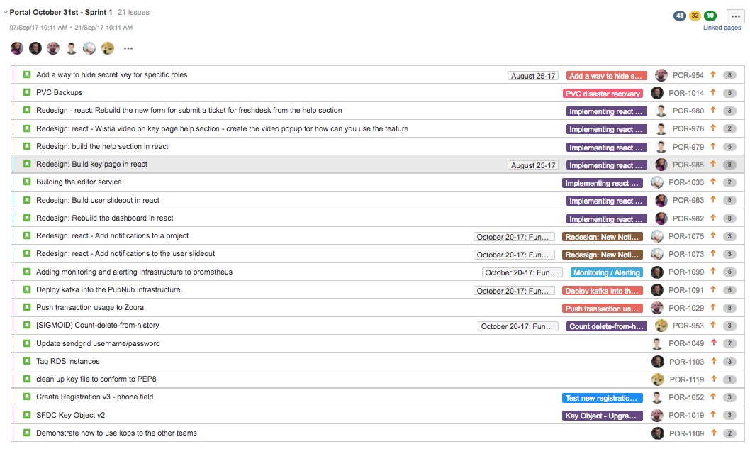
We mapped every touchpoint a developer hit: marketing site, automated email flows, signup, SDK install, first API integration, upgrade.
Each step got its own evaluation, friction list, and visual benchmark — then rolled up into a single journey artifact the whole team could argue against.
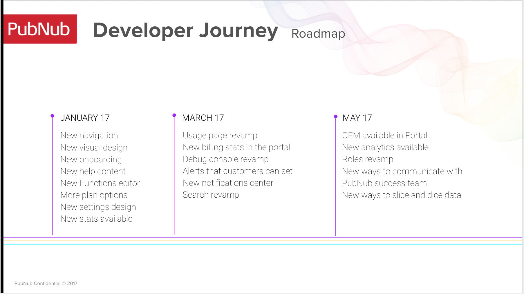
The journey audit fed into a quarter-by-quarter roadmap — sized small enough to ship, big enough to move the metric.
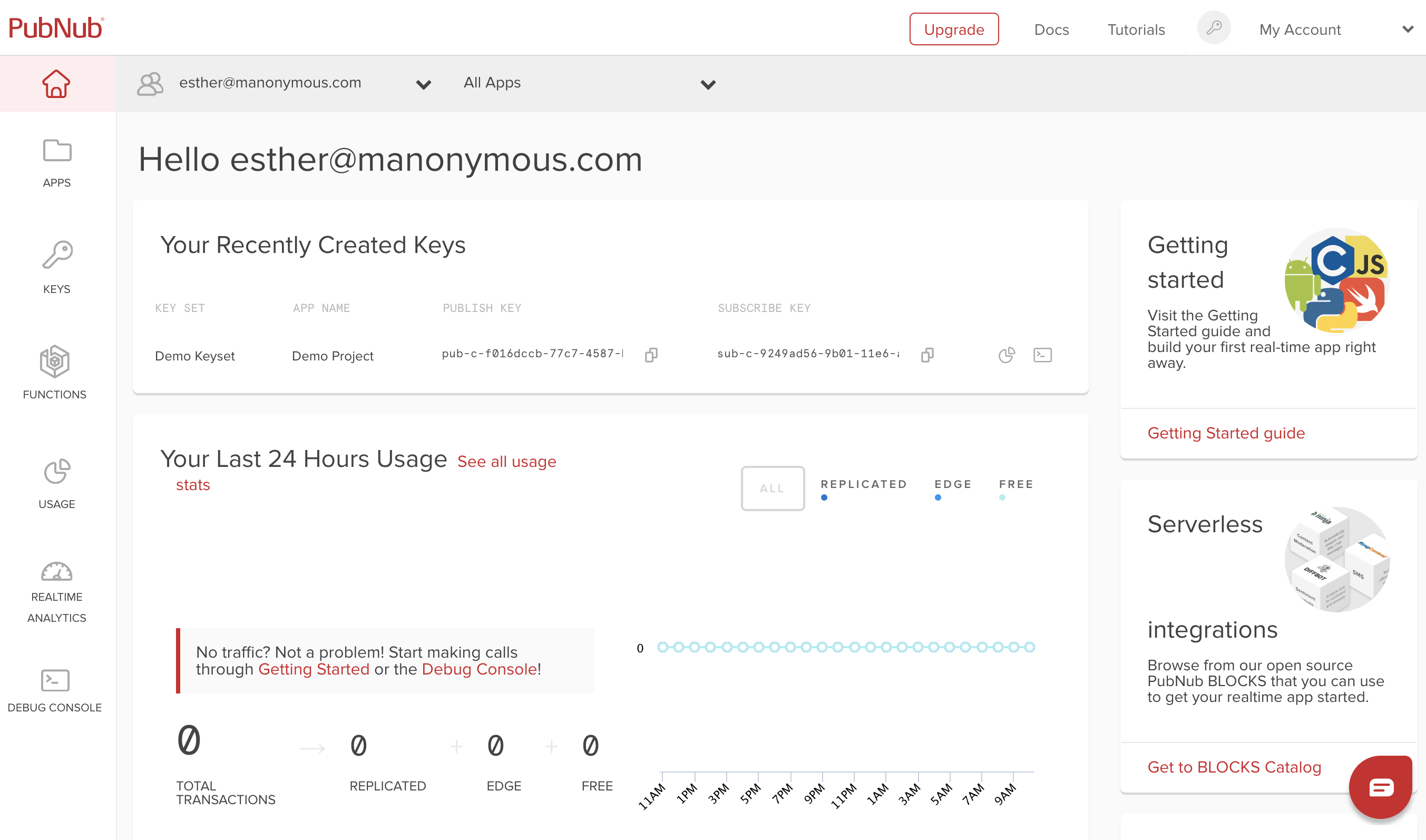
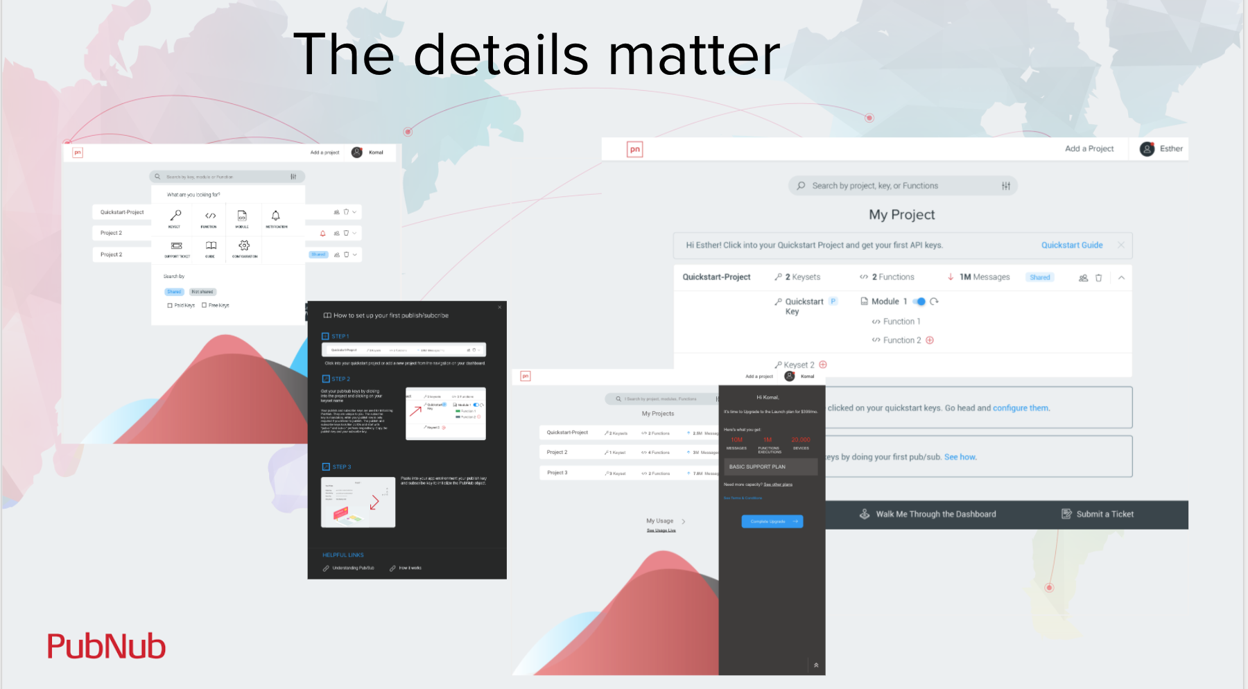
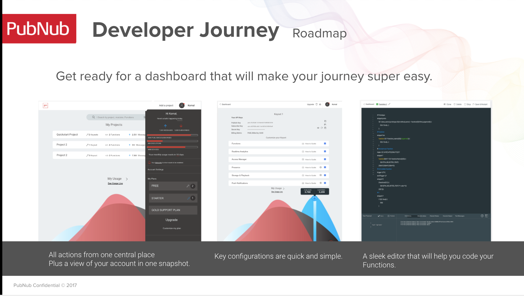
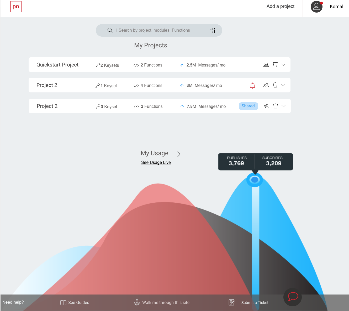
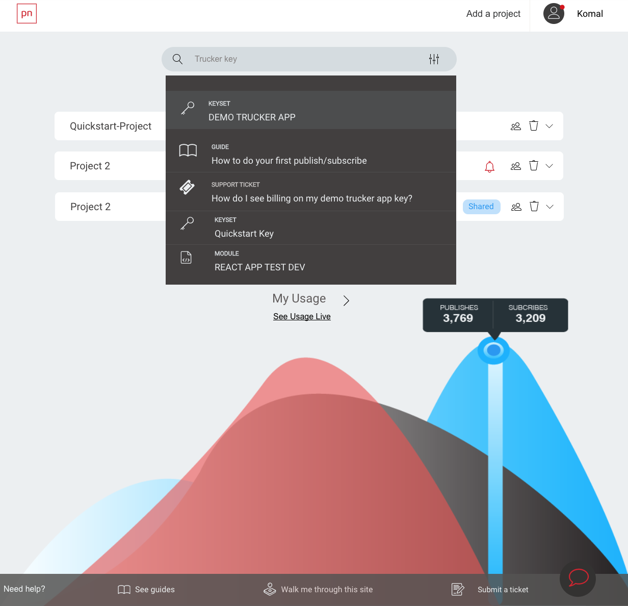
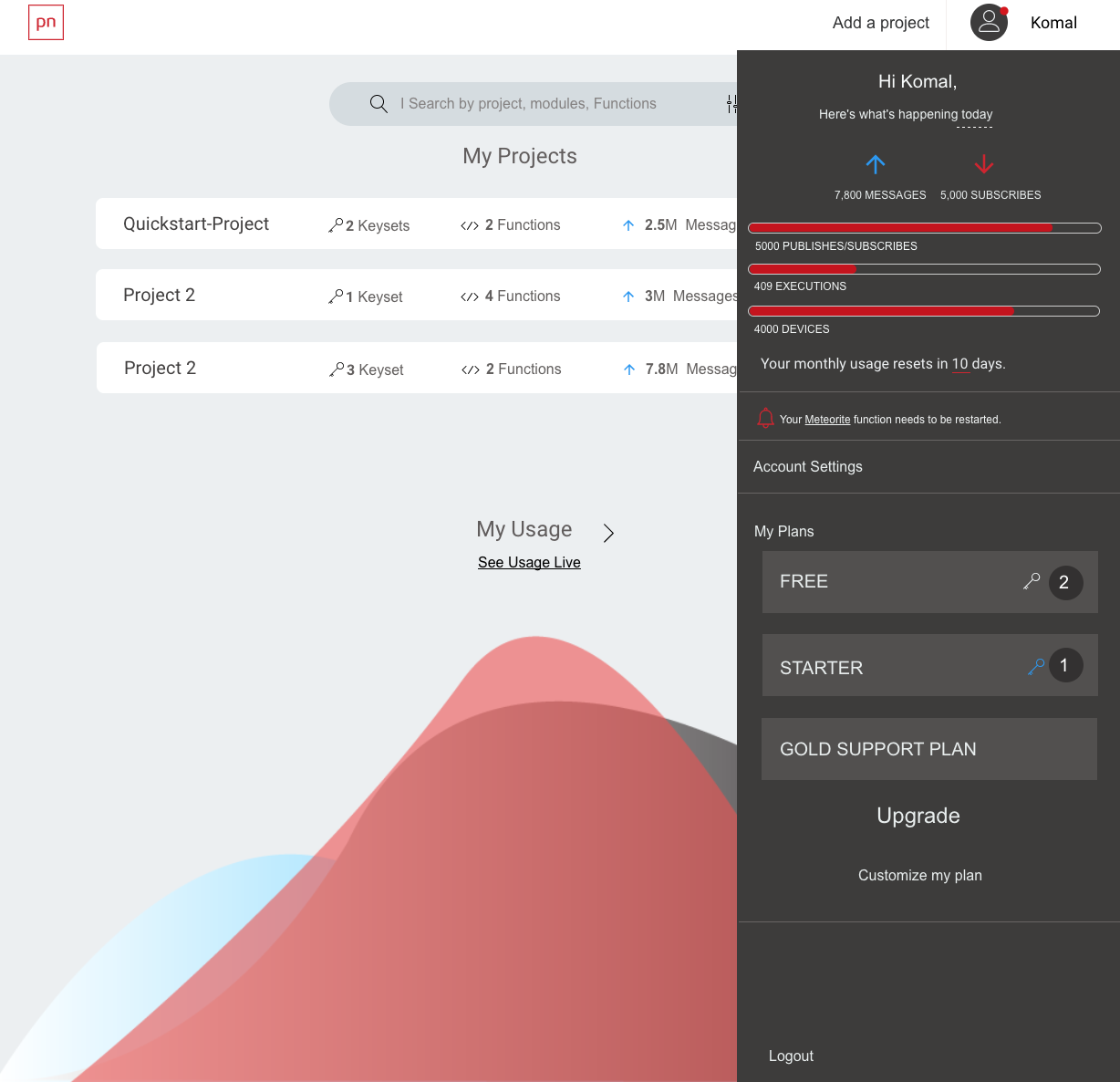
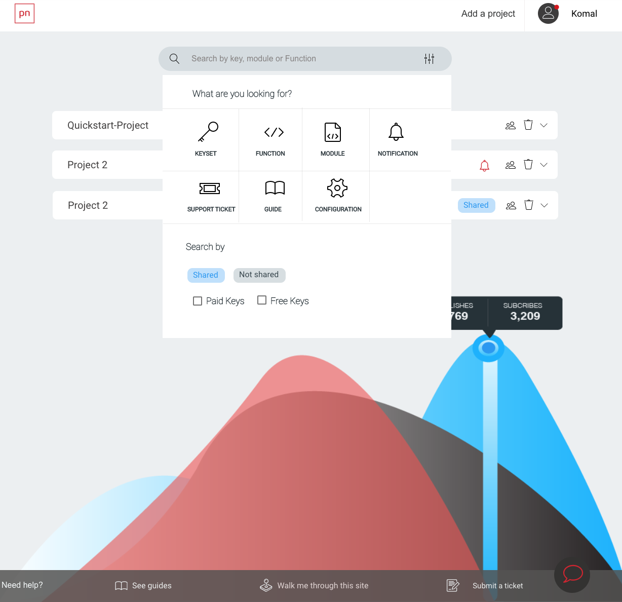
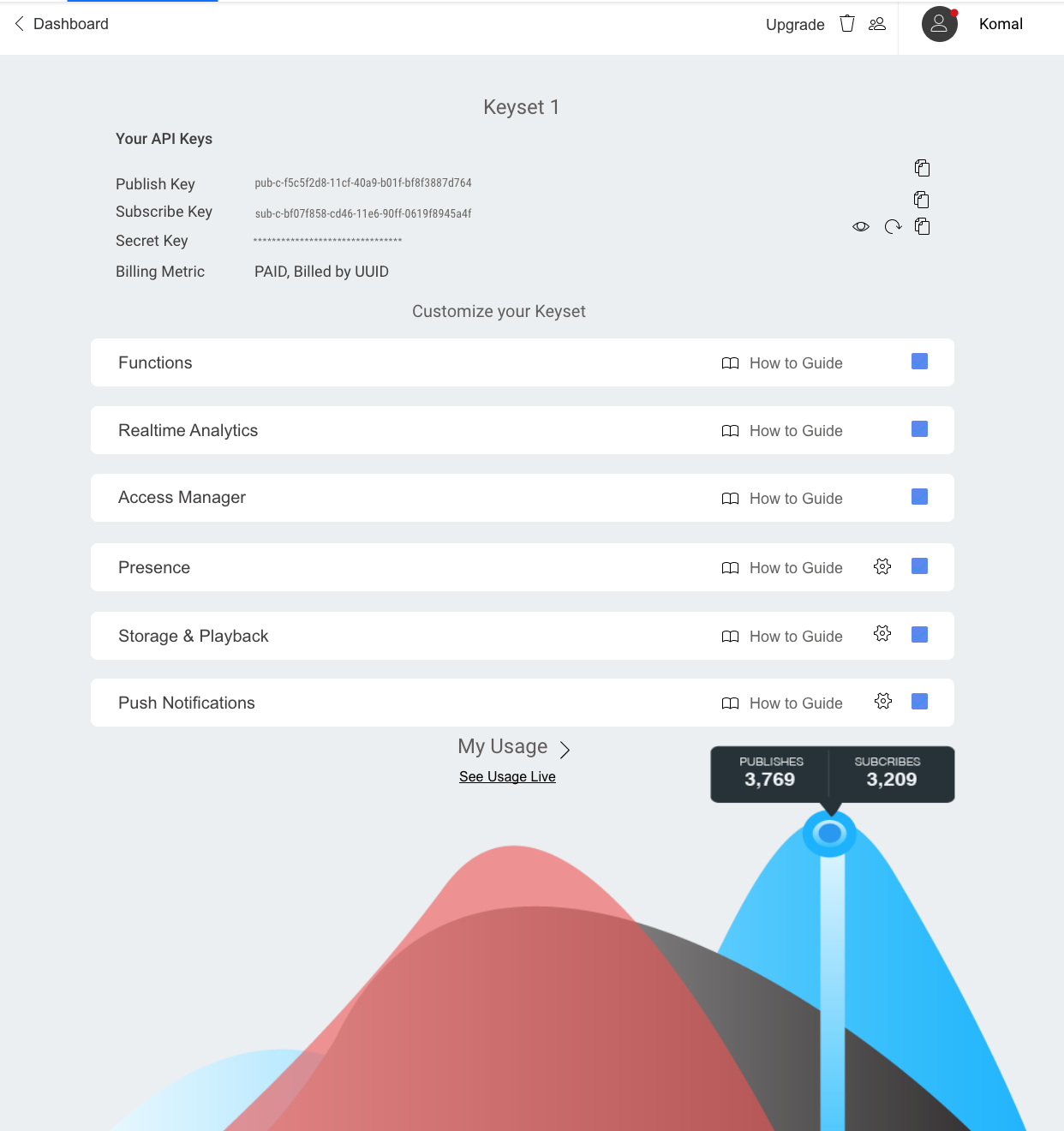
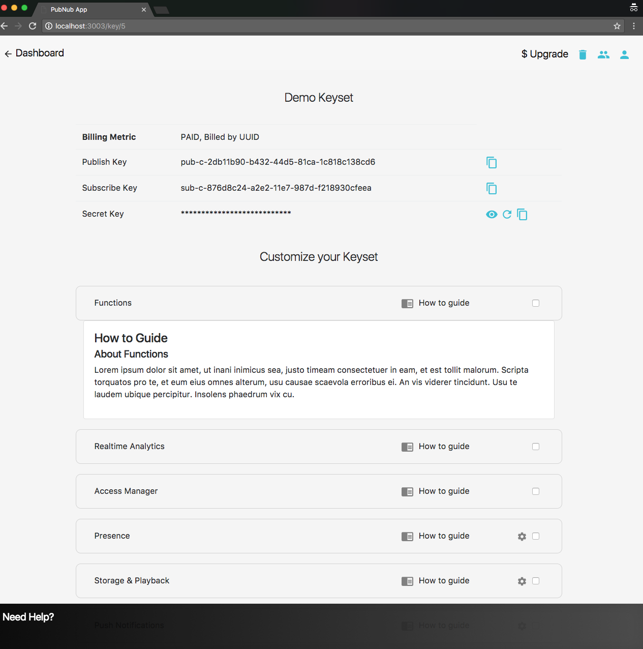
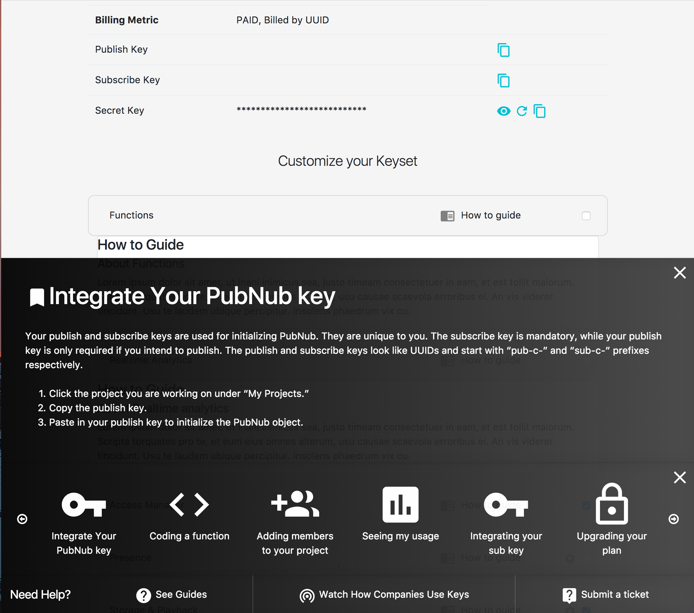
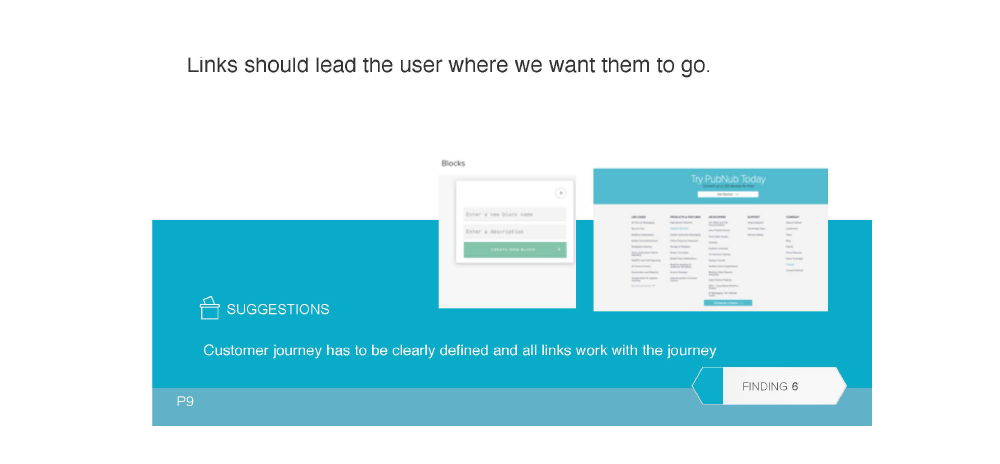
The redesigned admin portal puts analytics and live key creation front and center, simplifies navigation, and pushes help into context instead of into a separate site.
Documentation shortened, prioritized by what developers actually do first, and broken up by SDK rather than by API surface.
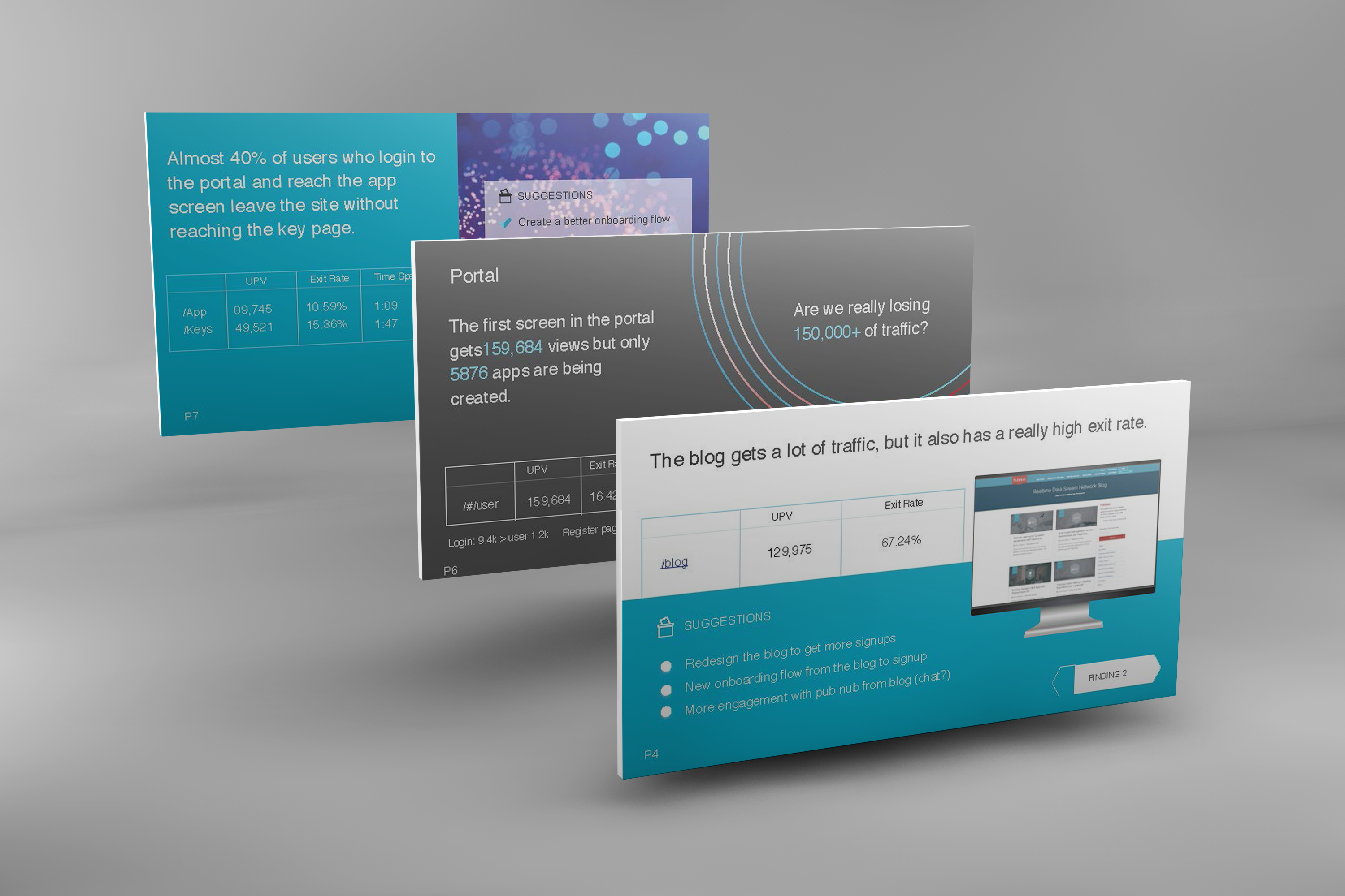
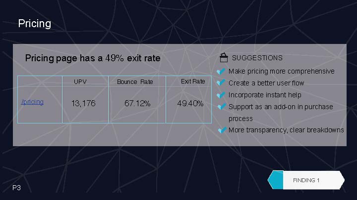
An analytics audit ran in parallel — looking at every event, exit, and engagement signal the existing product threw off, then mapping them against the new journey.
The result was a measurement plan that survived launch — and let the design changes actually get scored on outcomes.
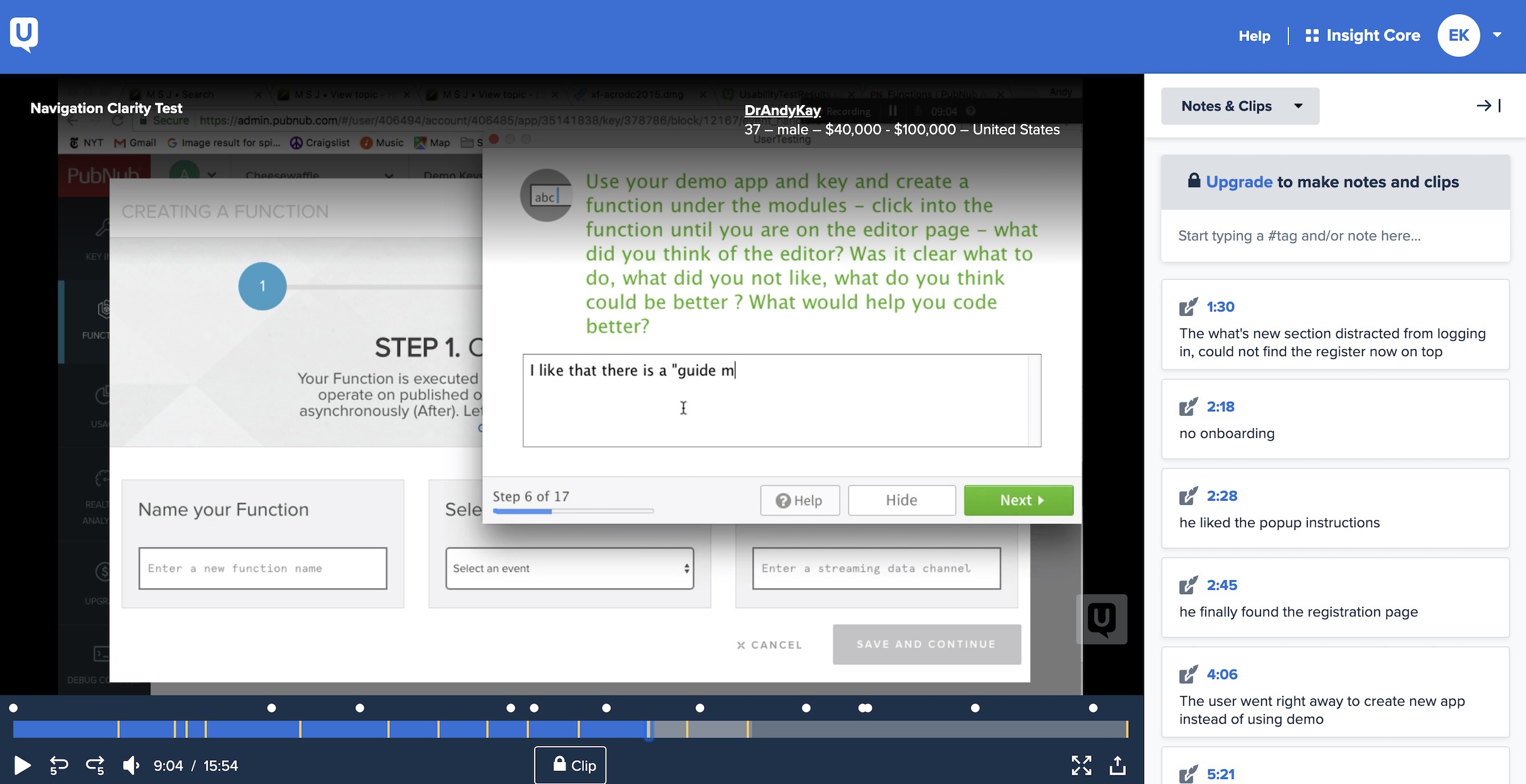
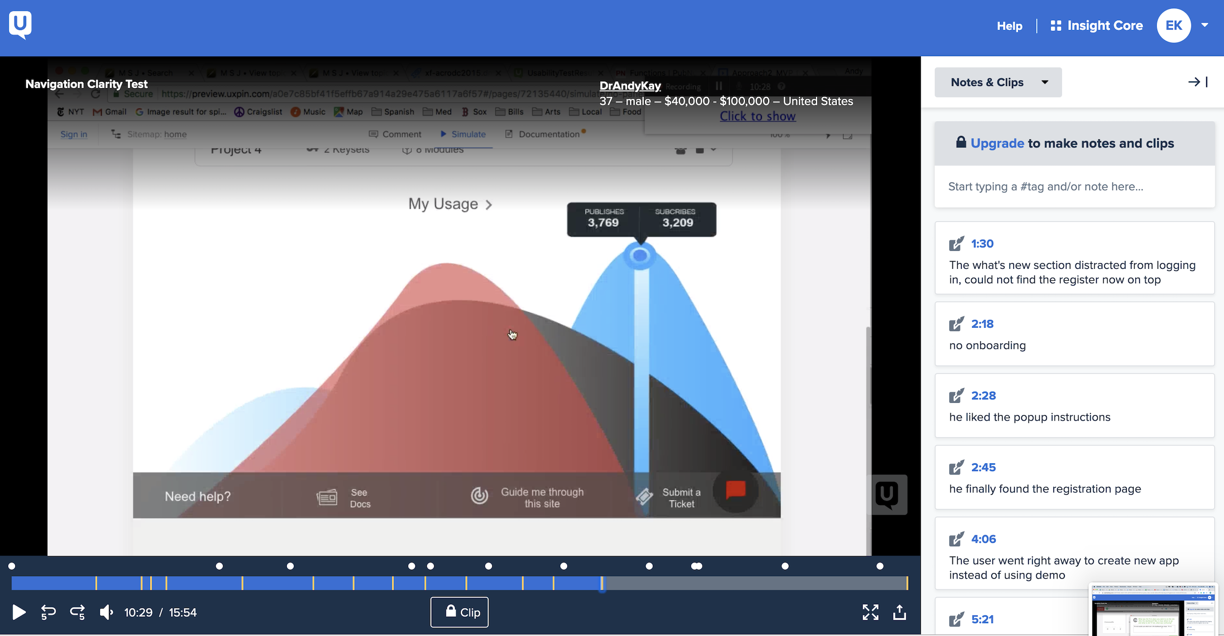
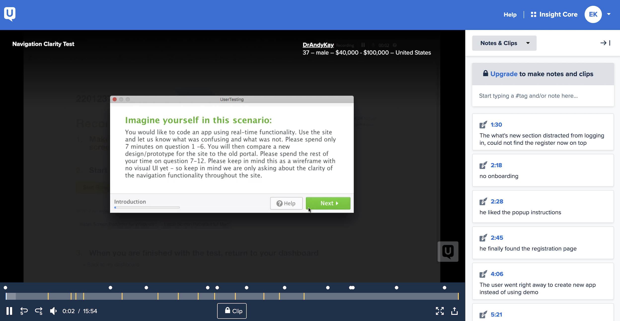
User testing ran after each design phase. We focused on questions like — how do they learn best? What do they want to see the moment they first integrate an API? What's confusing?
The findings drove help, notifications, integration design, and even how we named things in the portal.
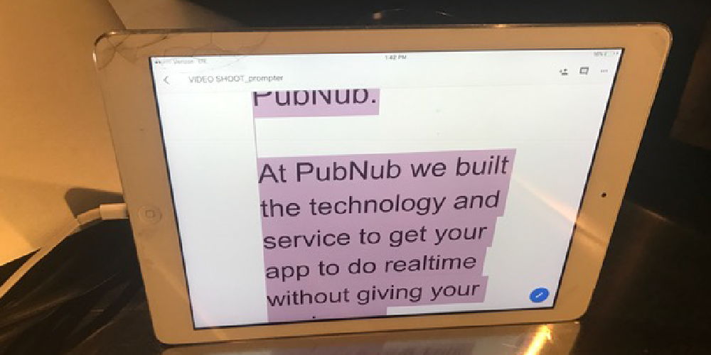
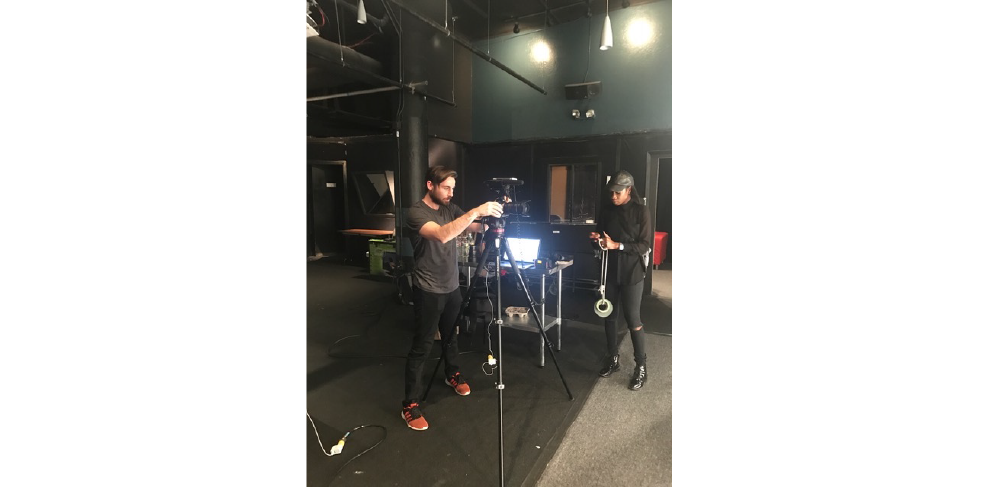
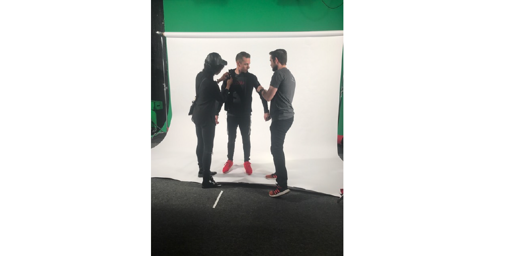
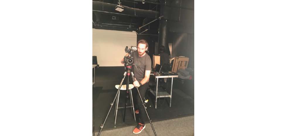
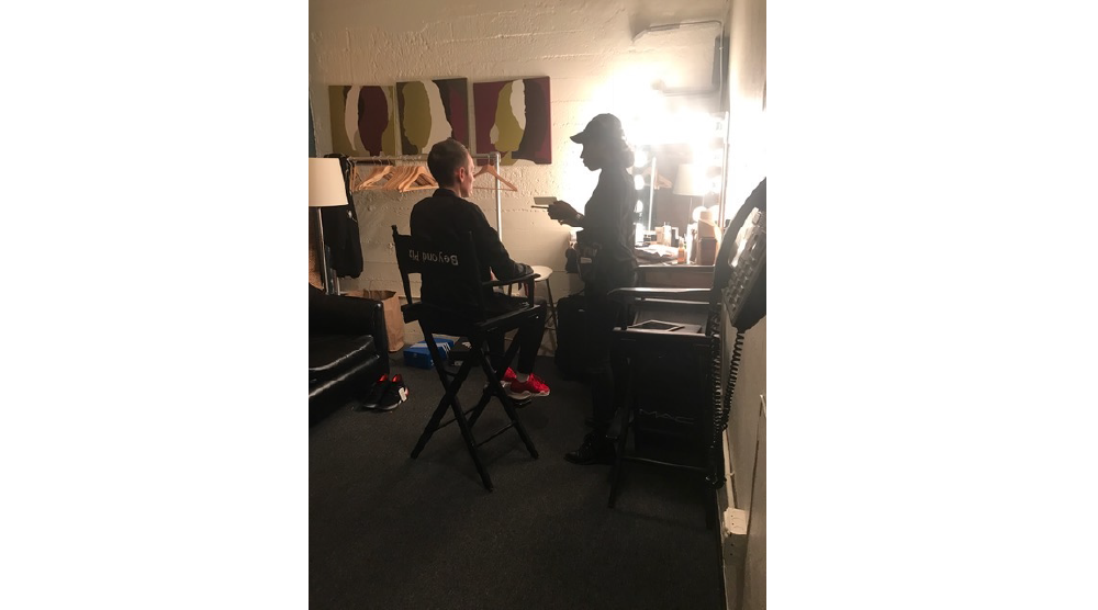
To drive conversion and retention, we created short video walk-throughs embedded directly in the admin dashboard — designed for developers who'd rather watch 90 seconds than read 9 pages.

"We finally have a developer journey we can defend in front of the board."— VP Product, PubNub
Working inside an engineering-first company meant a lot of the job was teaching, not designing. Design sprints, brainstorming sessions, and short workshops did more for the product than any individual screen I shipped.
If I were doing this again, I'd put the analytics audit before the journey audit — not in parallel. We'd have argued in numbers from day one, and saved ourselves a lot of meetings.