An easy-to-use platform for the complex job of caring for an ill family member — coordinating nurses, families, and the patients themselves in one place.
Families coordinating care for an ill relative juggle nurses, doctors, insurance, medication, and a constant background of worry — usually across phone calls, paper notes, and three different apps.
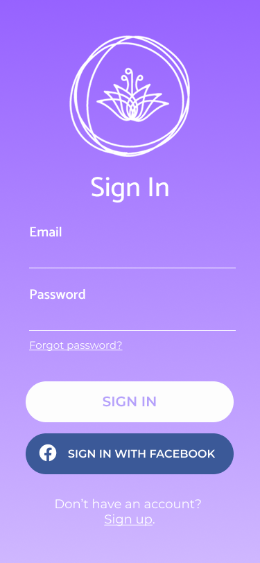
Lily set out to be a single place where families, nurses, and admins could meet around the patient — without anyone needing a clinical background to use it.
Lily needed to feel native to each user — family, admin, nurse, patient — while keeping the underlying record consistent.
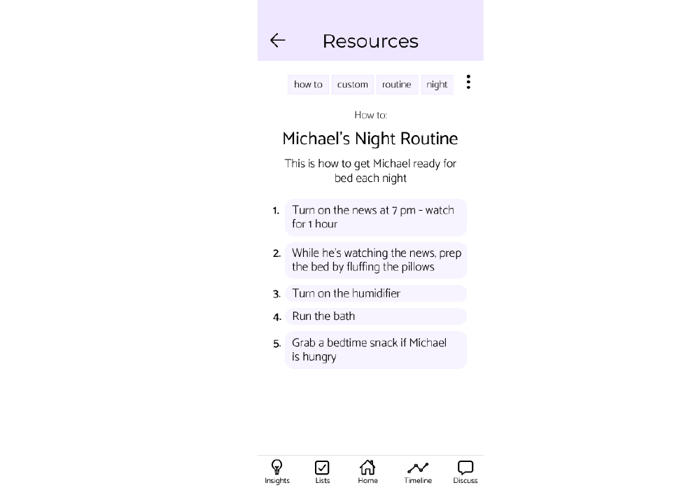
Vital signs, medication, appointments, and contacts compiled in a format families could bring to a doctor without re-translating.
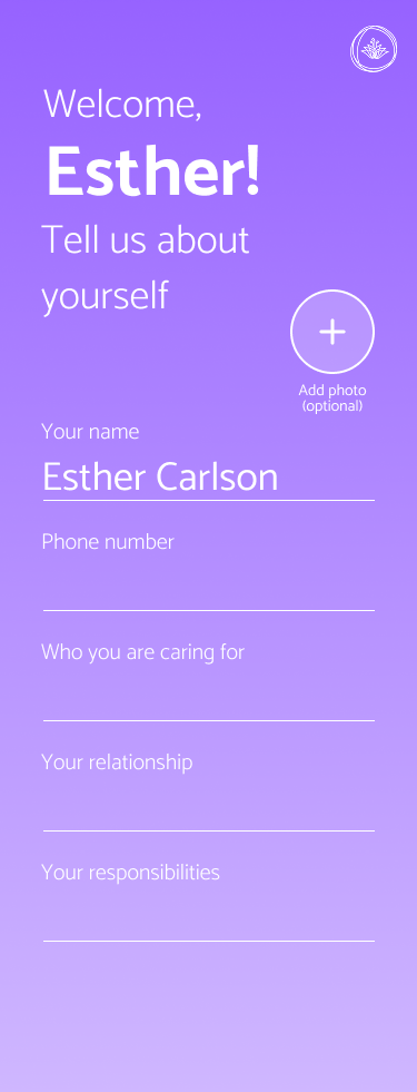
One family member can invite others, manage access, and handle billing — without leaking sensitive medical detail to people who don't need it.
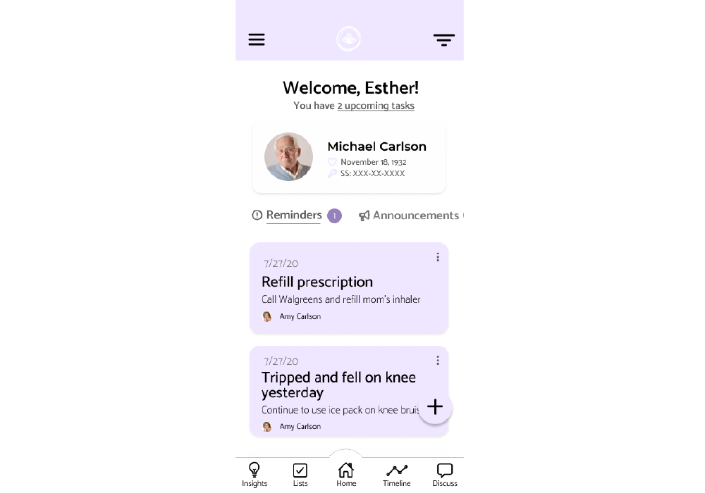
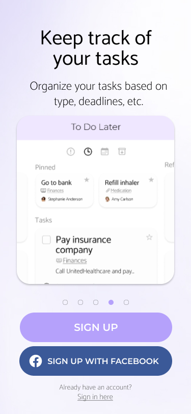
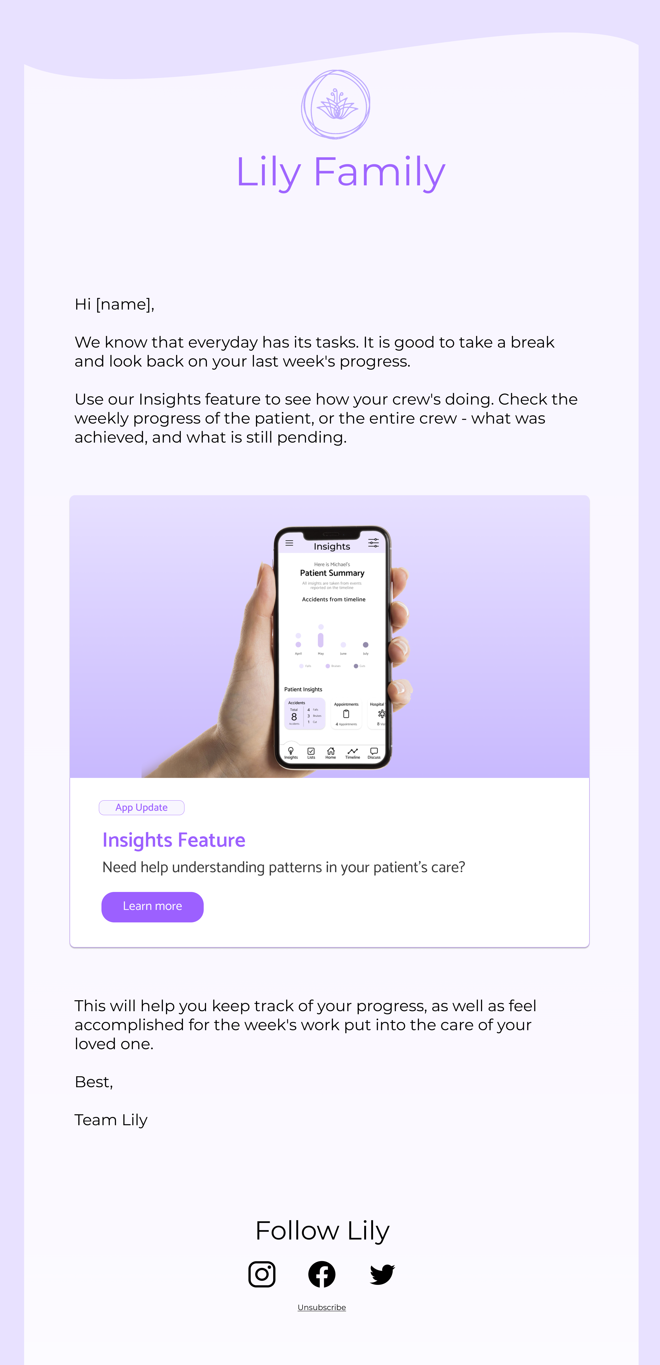
Quick observations on mood and diet, schedule management, and one-tap transport booking for home visits — designed for thumbs and gloves, not desks.
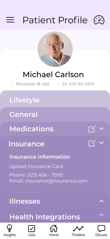
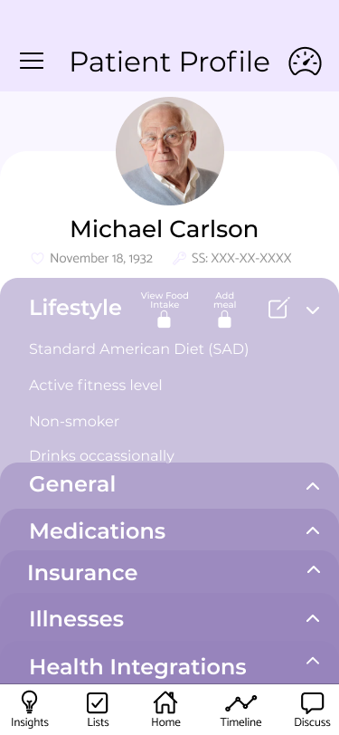
Personal details, lifestyle tracking, medication, insurance, diagnoses, and wearables — all in one place, all editable, all auditable.
The patient profile became the spine of the app: lifestyle, nutrition, fitness, medication, insurance, diagnoses, and connected wearables — all in one place, plain-language by default.
Designed so the next person reading it could pick up the thread in under a minute.
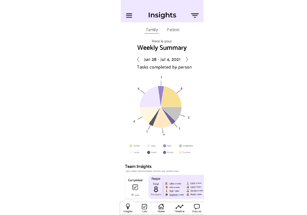
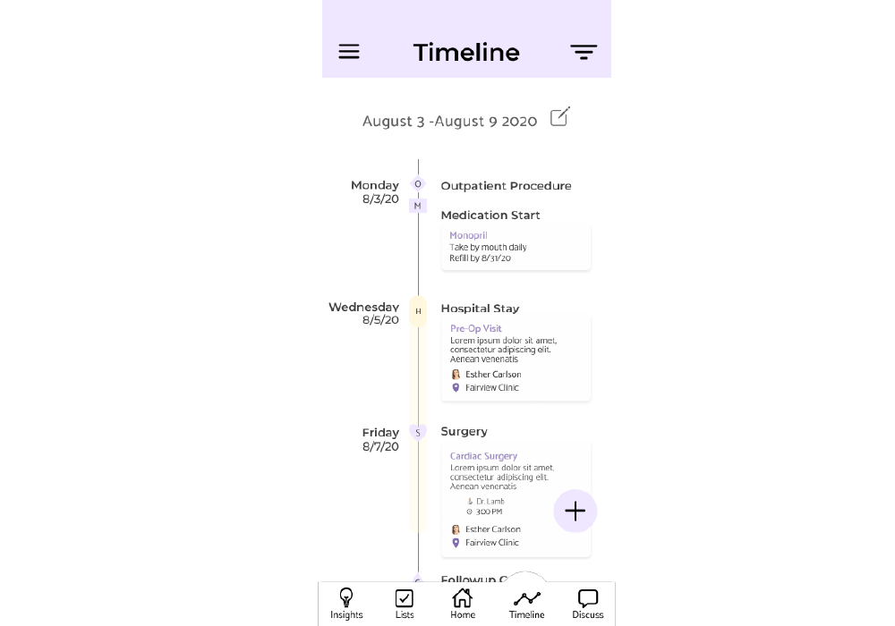
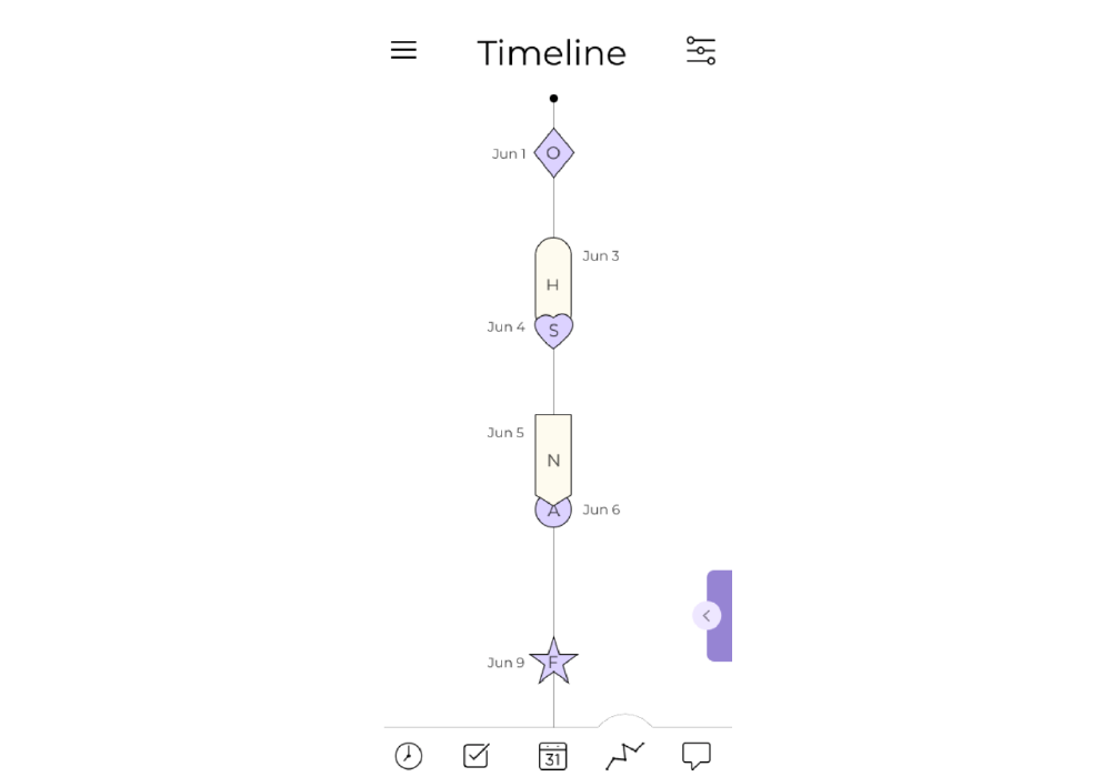
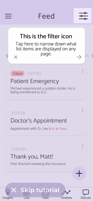
The home screen reads like a relay handoff — what's happened, what's upcoming, what needs attention now.
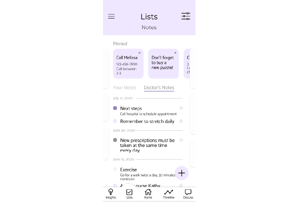
Timeline, notes, resources, and decision room all reachable in two taps from anywhere in the app.
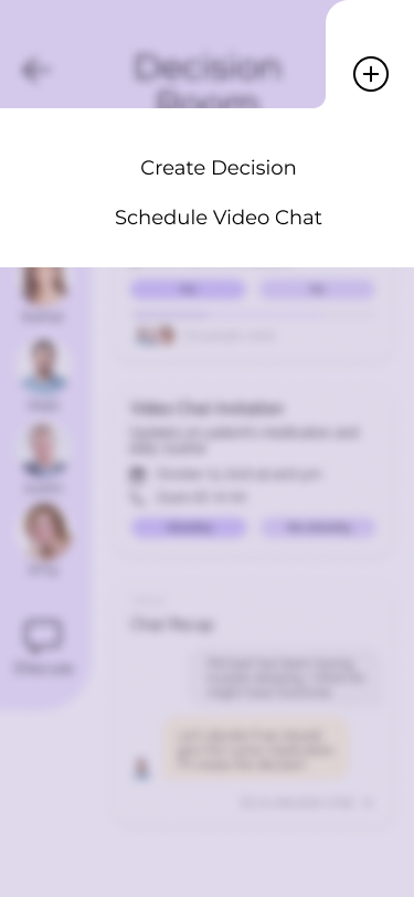
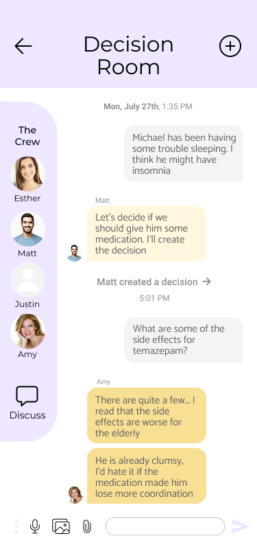
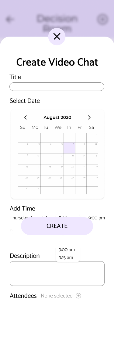
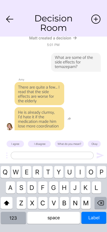
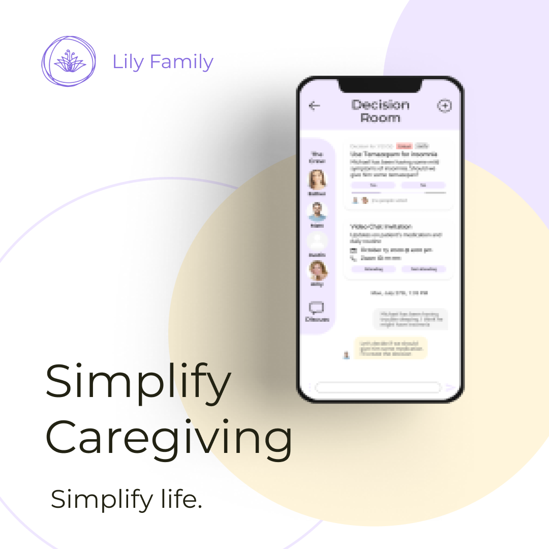
The Decision Room is where families talk through hard calls. A conversational layer surfaces relevant context from the patient's record and suggests prompts that move discussions toward concrete decisions.
Designed to be a moderator, not an oracle — the room ends with a decision the family can sign, not a wall of model output.
The nurse portal had to survive a shift. Quick observation entry, integrated transport booking for home visits, and a schedule view a nurse can read in the doorway of a patient's room.
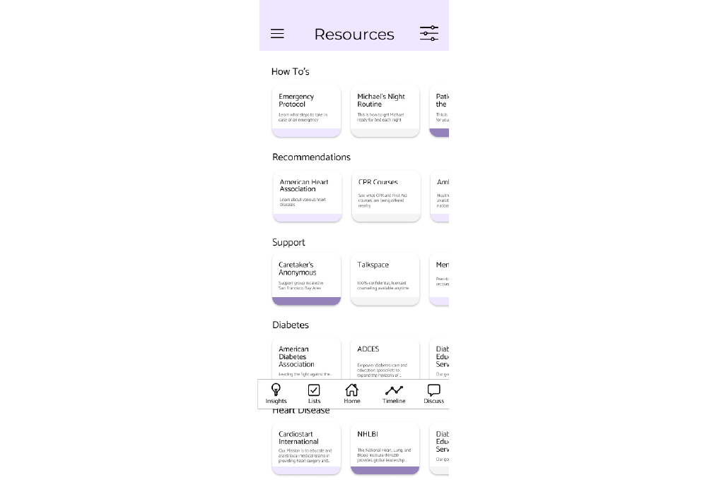
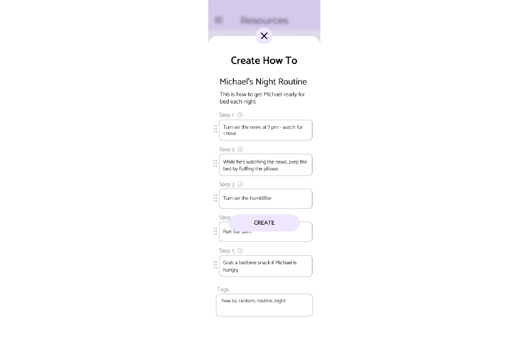
Caregiving content has a tendency to read either clinical or saccharine. We aimed for the third path — quietly competent — across the marketing site, ads, email, and social.
"The first caregiver app that felt like it was built for us, not for our diagnosis."— Beta family, week three of pilot
The hardest design problem wasn't the feature surface — it was the emotional one. Caregivers don't open the app on good days. Every screen needed to assume the worst day of someone's week and still be reachable.
If I were starting again, I'd run the emotional copy through clinicians first, then the visual design — not the other way round. The words do more of the heavy lifting than I expected.