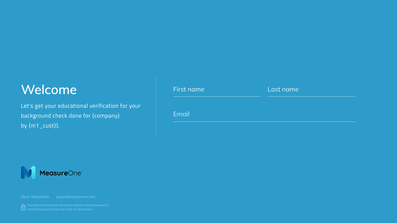
A consumer-facing verification product and matching business portal — for auto insurance, employment, and income checks that don't make people quit halfway through.
MeasureOne runs data verification for businesses — auto insurance, employment, income. Their challenge was getting consumers all the way through a flow that fundamentally asks them to hand over private records.
My job was to design a product that feels simple enough that a consumer finishes, and structured enough that the business gets a clean, verified record on the other end.
Animations on closing screens, illustrated empty states, and small motion details that make a data-upload tool feel less like a tax form.
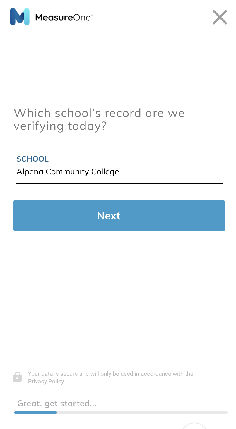
Banks, payroll, payment processors, and direct document uploads — surfaced as a single 'connect or upload' choice the consumer can understand.
Businesses needed enough surface to request and re-run verifications — and nothing more. The portal stayed deliberately small.
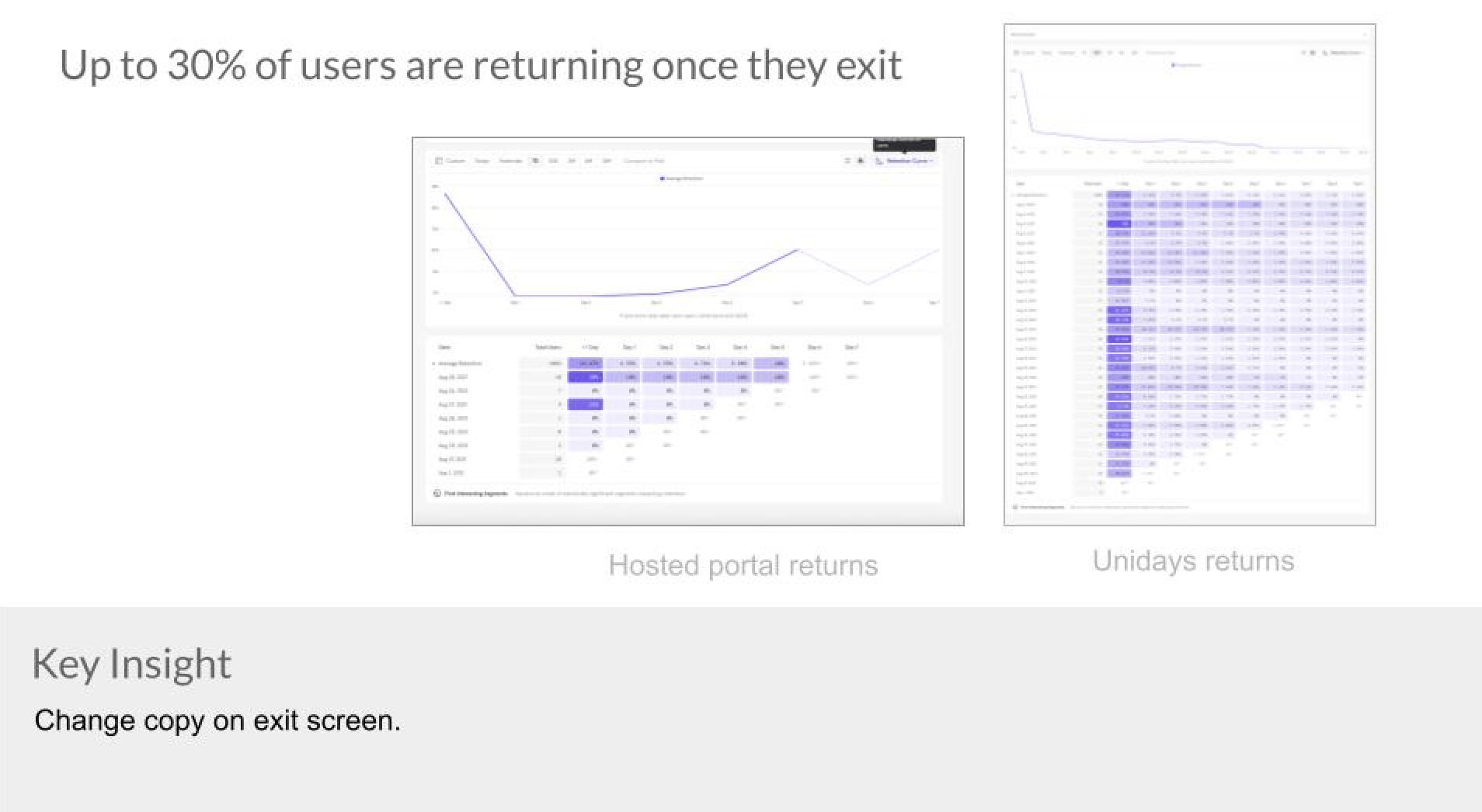
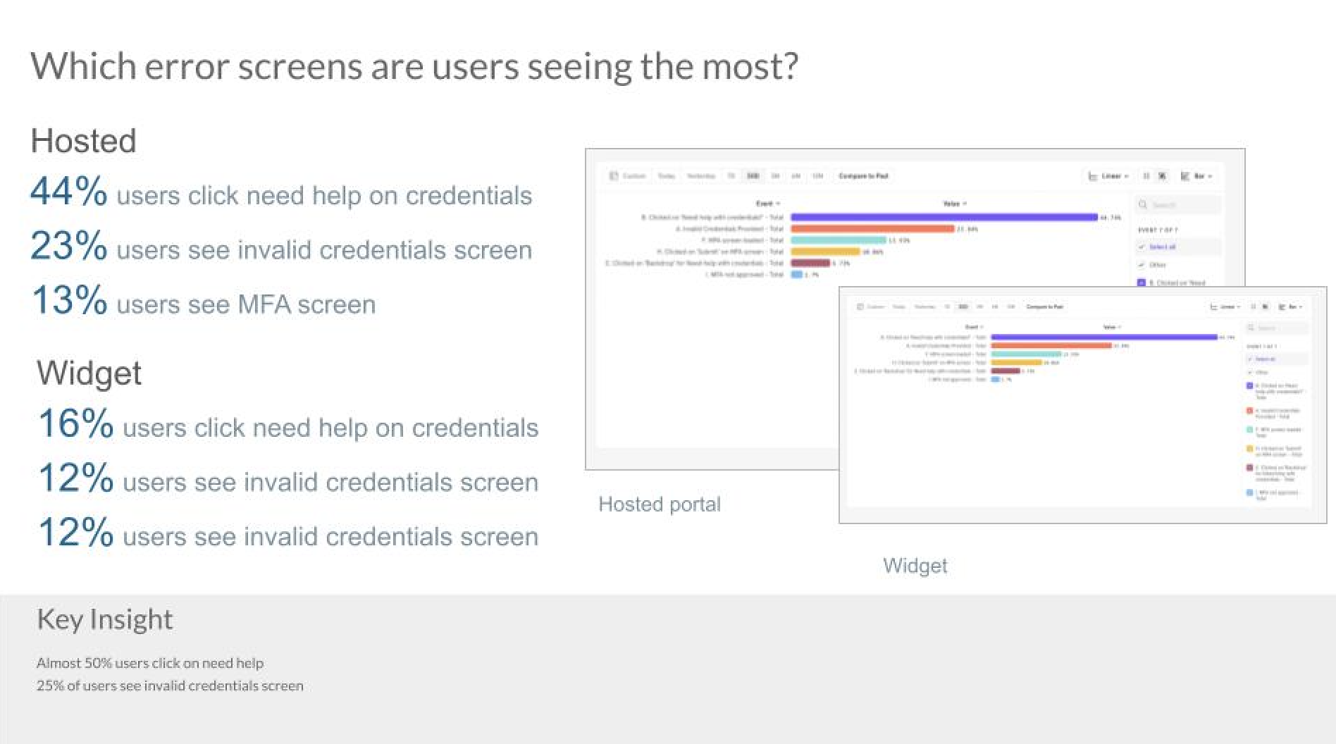
Every screen, button, and exit point tied to analytics from day one, so we could track impact rather than vibes.
The visual language stayed minimal and confident — but never sterile. Each screen carries one small detail meant to remind the user there's a person on the other side of the design.
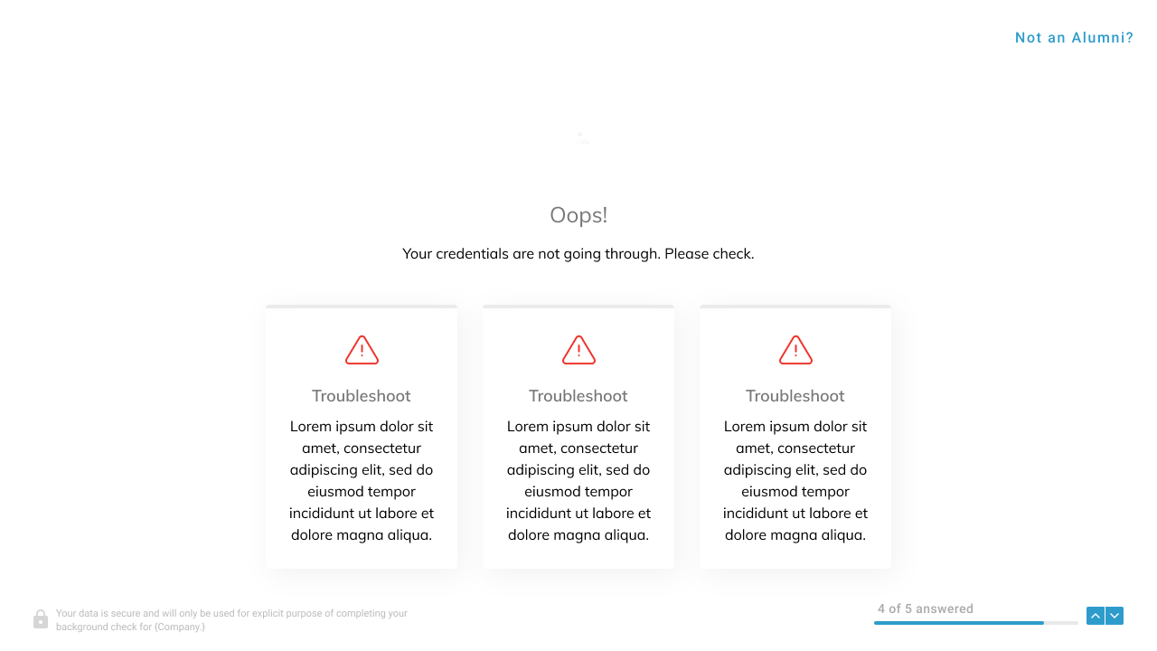
Loading, waiting, and error states are usually where consumer flows lose people. We gave them small Lottie animations with a consistent personality.
Audio waves animate on user tap; the spinner has its own logic; school-not-found gets a hand-drawn illustration rather than a red box.


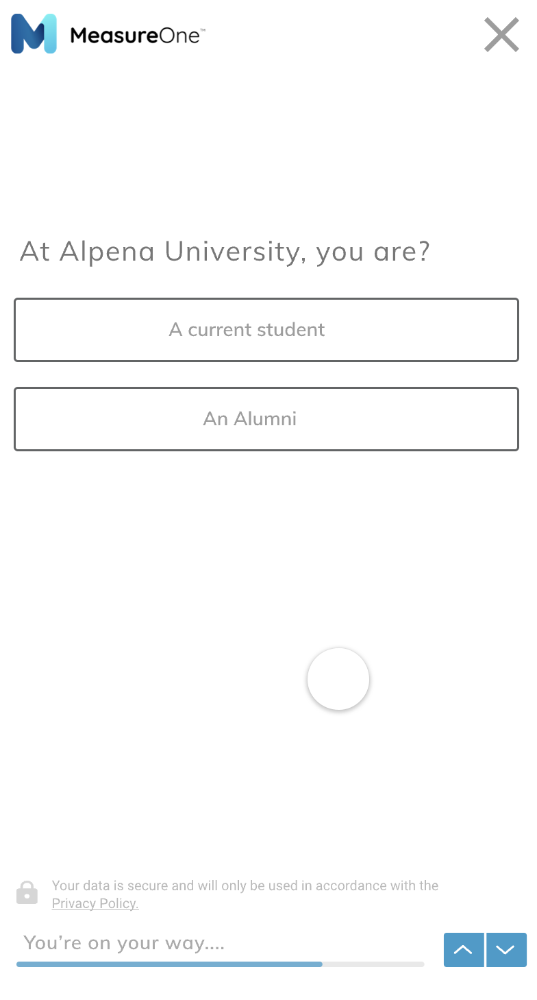
The business side asks consumers to share specific personal data — insurance details, student enrollment, degrees, salary, recent employer.
The portal was designed to keep that surface as small as possible: request a verification, see its status, re-run if needed. That's it.
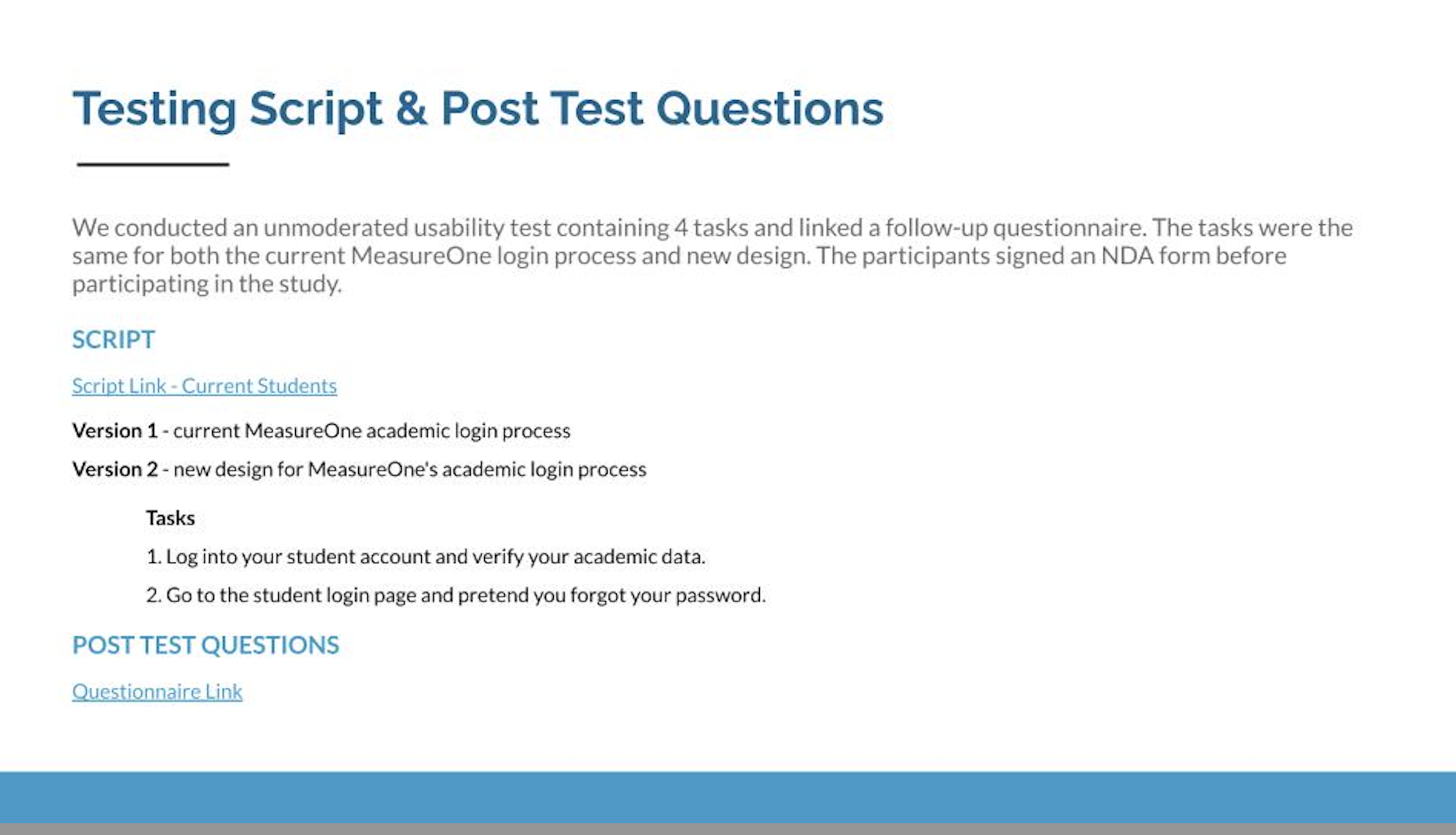
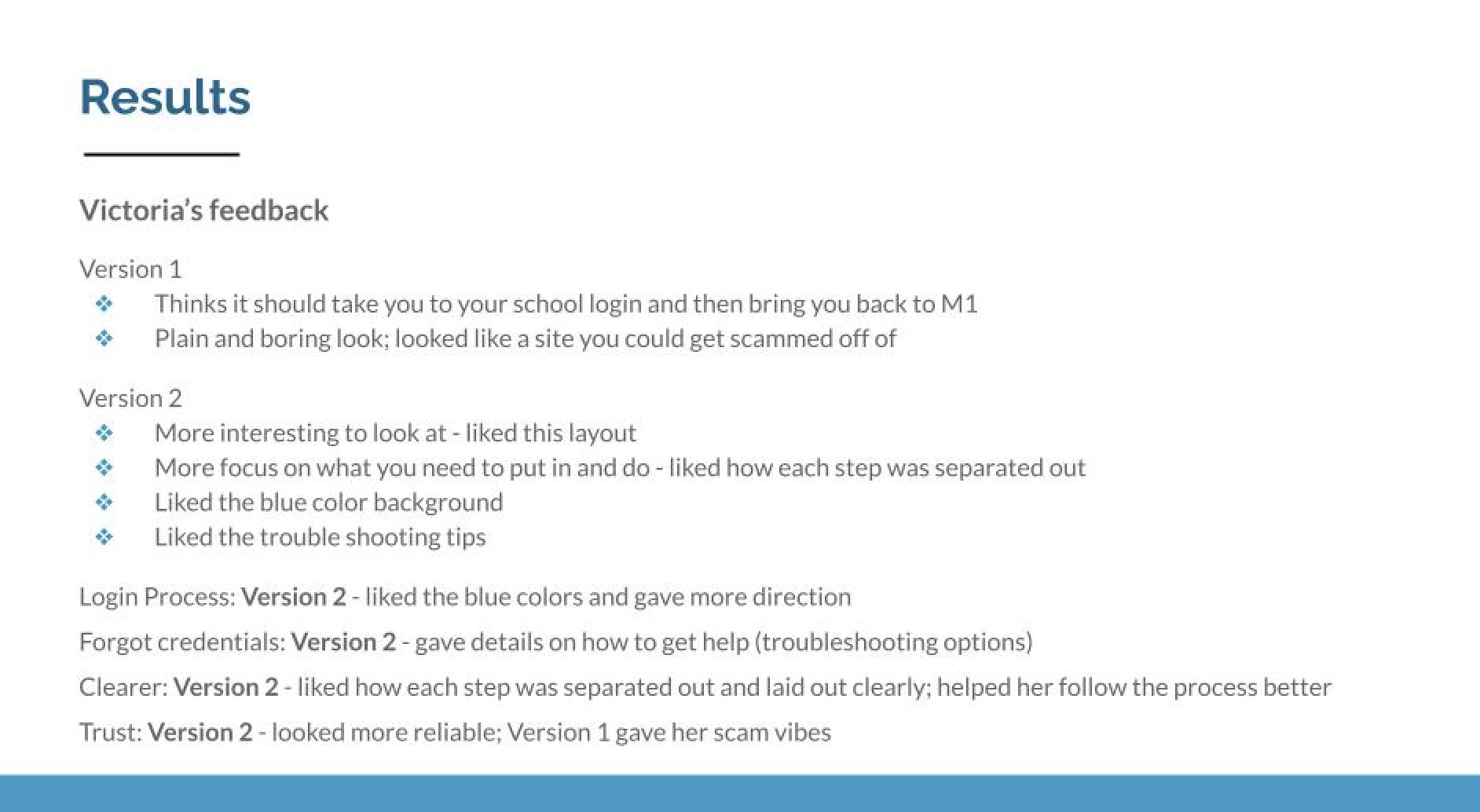
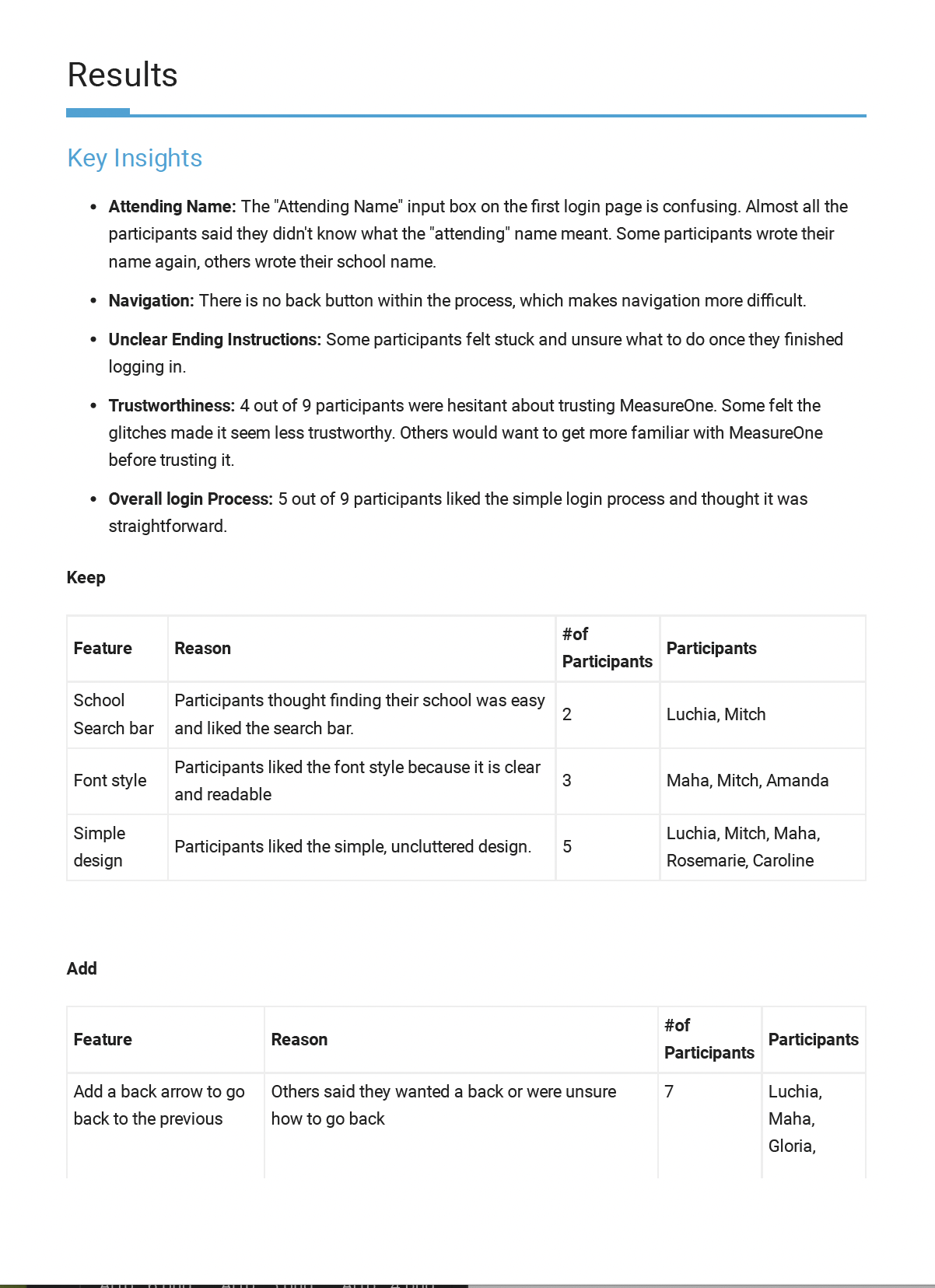
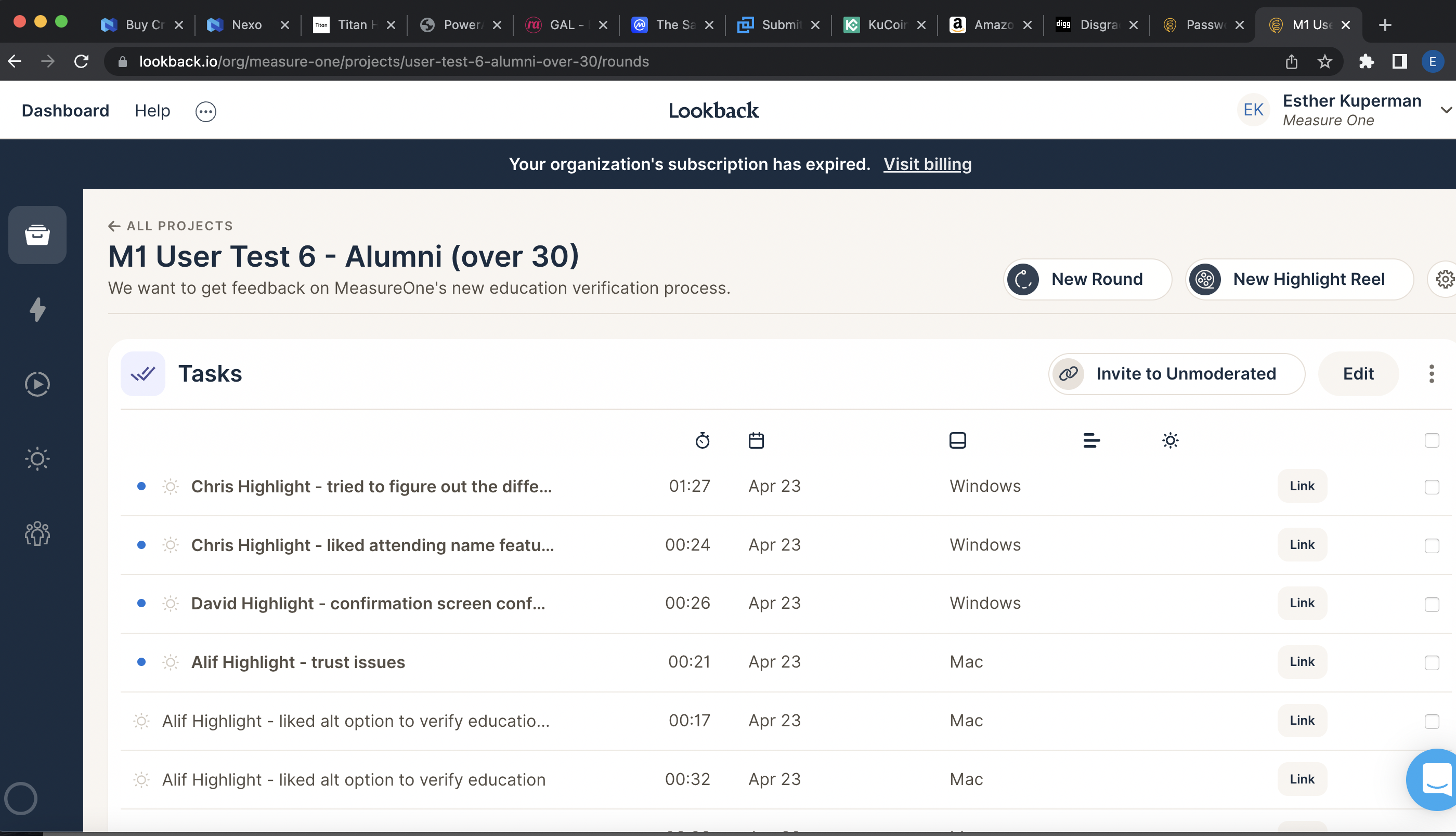
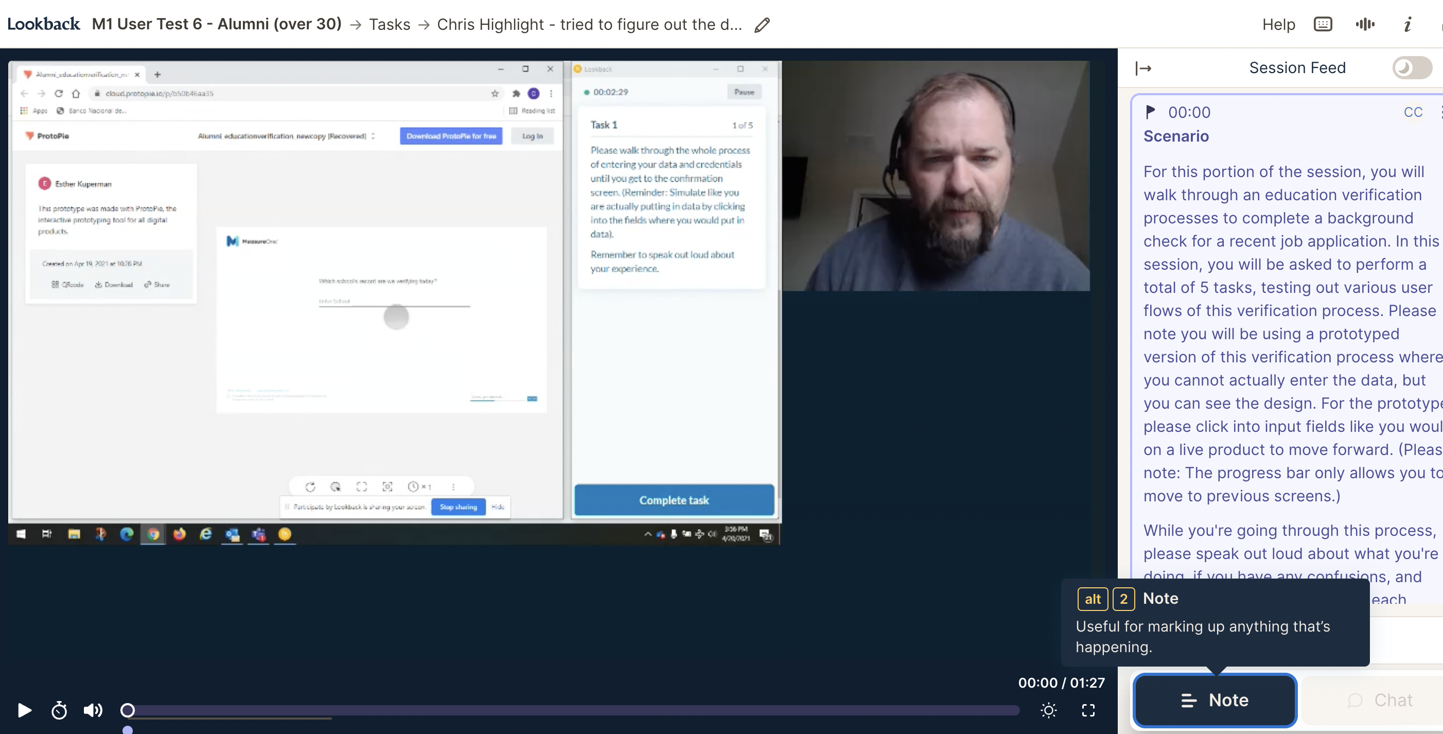
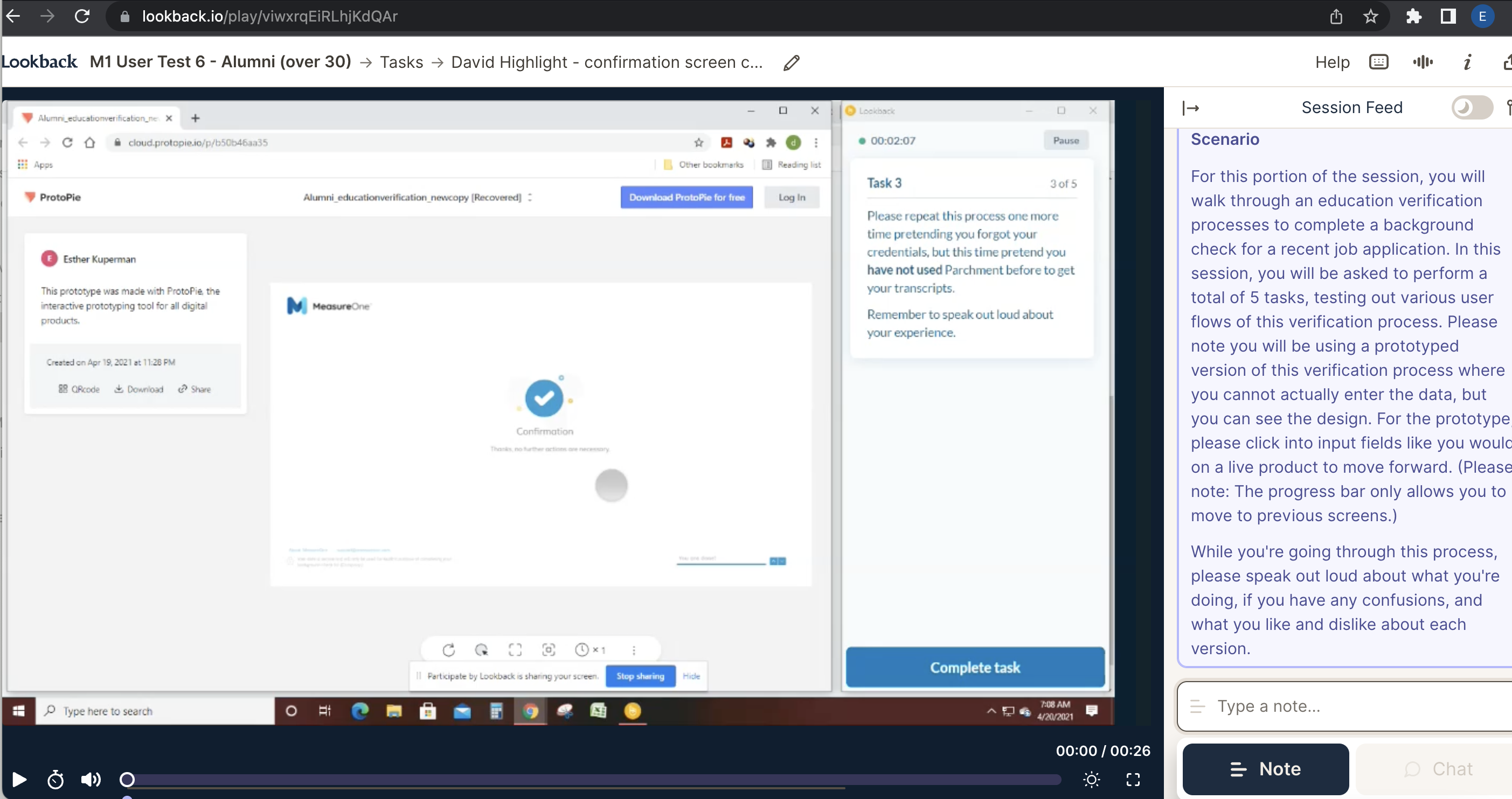
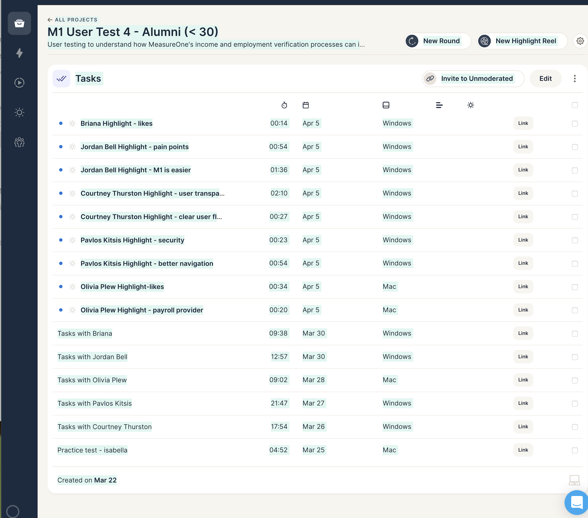
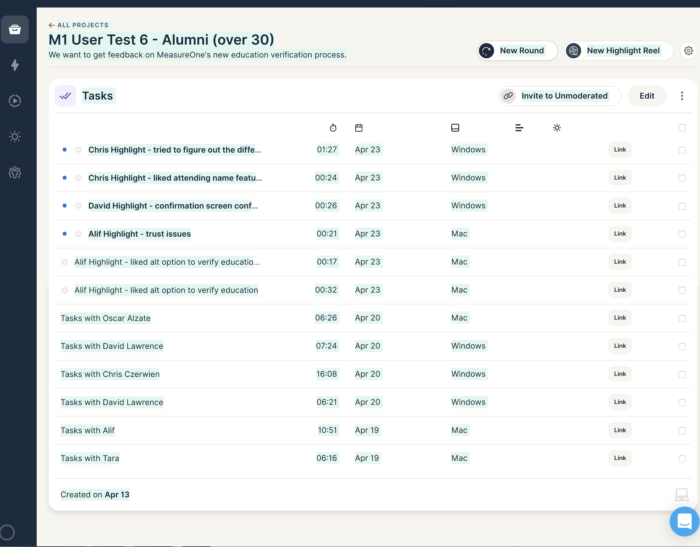
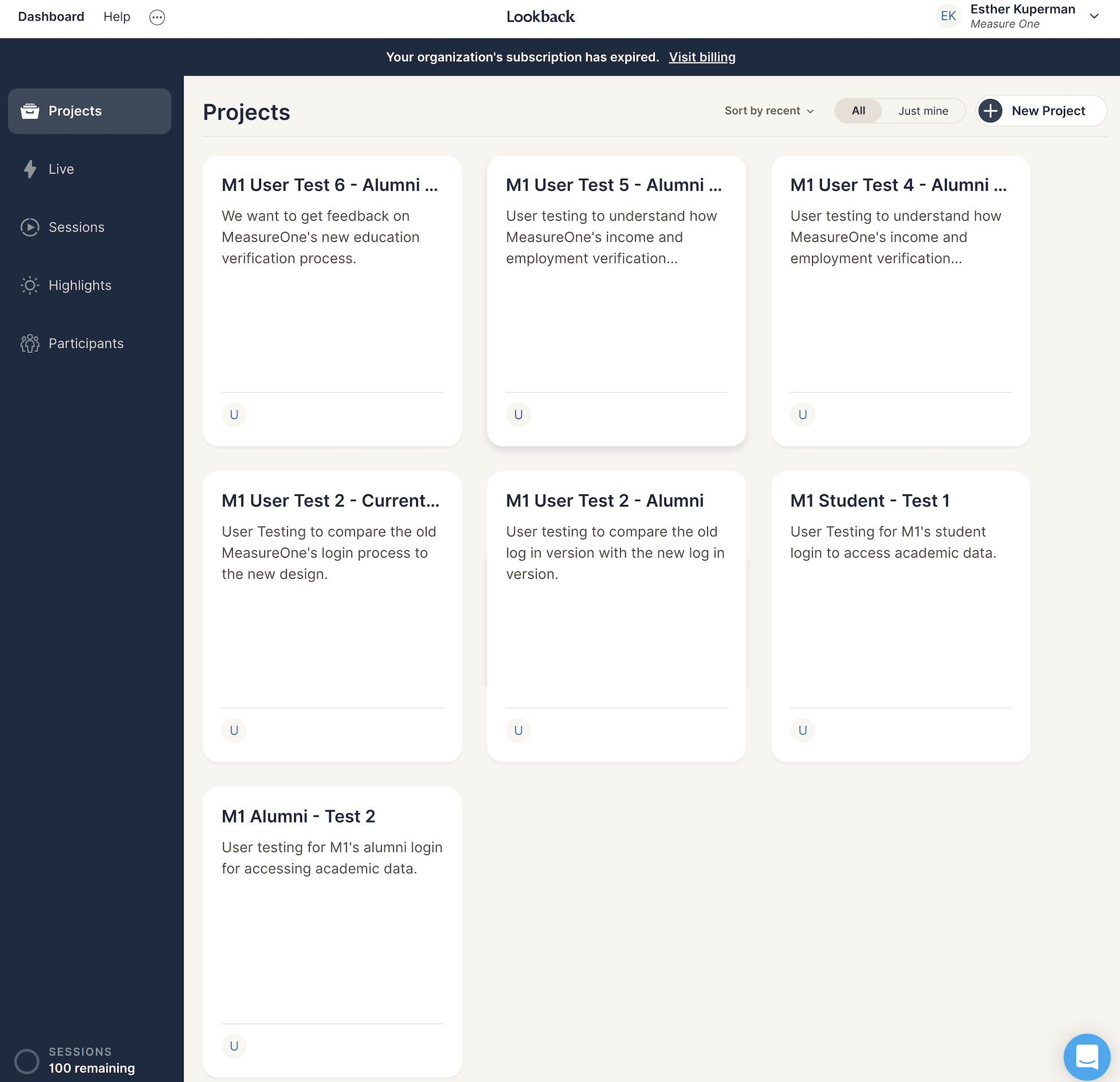
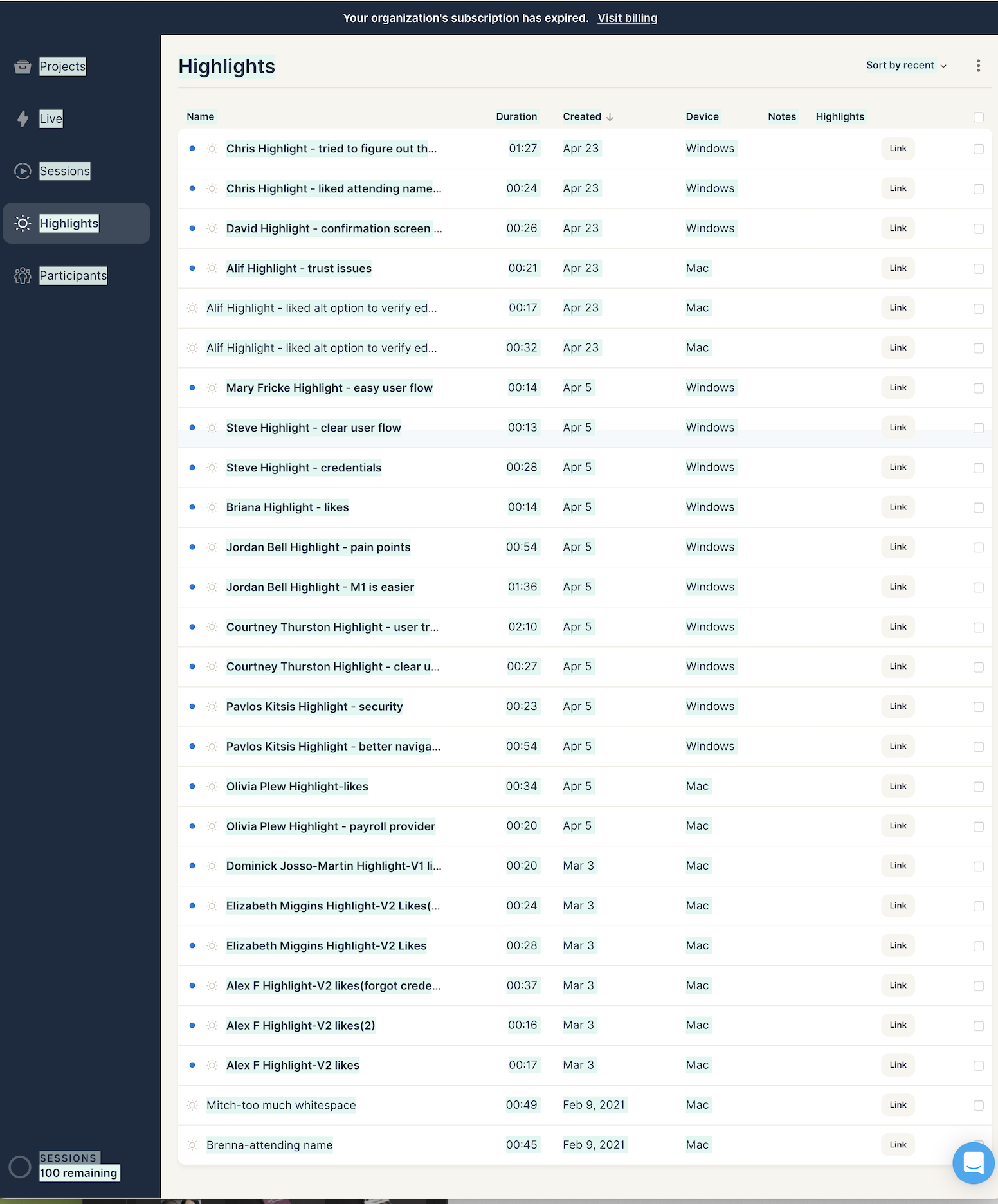
We ran a series of 8 rounds with students and alumni across multiple universities — observing where they paused, gave up, or got stuck.
Findings were organized into a Keep / Add / Change framework, fed back into the design, and re-tested.
"It was the first product in this space that respected the people on the consumer side of the flow."— CEO, MeasureOne
The most useful decision was treating error and waiting states as first-class screens, not edge cases. They're where consumer trust is built or lost — and they're usually where designers spend the least time.
Working with analytics from day one changed the conversation with the executive team too. We argued in numbers, not opinions.